Viewing entries in
Uncategorized

The things that bug us

Ahh, the joys of late summer and early fall. Excellent sunsets, the start of fall colour, and...flies! We've inadvertently captured two of the little buggers in photos over the last month. The first one was spotted by the eagle-eyed, detail-oriented folks at TQ Construction. Can you see it in the preview image we sent them?

Spot the fly!

This was the very last photo of a long day's quick-turn-around shoot of small projects we did for them that became affectionately known as the "Terrific TQ Tri-Cities Trifecta", so we missed it completely until they noted in their editing instructions "there is a fly on the windowsill, please remove this photo-friendly insect". No flies on them, apparently! The final version:

MKPhoto-1921


The next one I spotted was in an edit this morning for Monica Jeffers Interior Design, of her uber-cool lobby for the Coast Hotel on Marine Drive. Noticed a little dot, and zoomed in on it...

mjid-coast26636


...and there it was. The winged beast in all its glory--before being virtually swatted with the clone brush.beast

And to put the obligatory disclaimer on: no flies were actually harmed in the production of either of these images.

A loud bang and a big splash

Those of us who own boats usually do everything we can to keep them (either ours or our friends') from sinking. So, it's a rare occurrence to get to watch one--not one's own, naturally--take its final voyage down to Davy Jones' Locker. While it took years of prep (of various varieties, including a couple of lawsuits) on the part of the Artificial Reef Society of BC to make it happen, the actual sinking of the HMCS Annapolis in Halkett Bay on Gambier Island, for the purposes of creating an artificial reef, took just a couple of minutes. Made for a fun shoot and a fine day out, thanks to my friend Sean Murphy being in the right places and knowing the right people to have a bunch of us end up on the right boat in a great position to watch the Annapolis go down. Just like a good twilight exterior: lots of prep, a seemingly interminable wait...and then a few minutes that leave you with amazing photos if you do it right.


Credit Where Credit's Due

Florian Maurer, architect of the marvellous Sloan/Berkes Residence featured on the front cover of our calendars this year, pointed out that the back-of-the-calendar credit is incorrect. The correct credit should be to Allen+Maurer Architects, Ltd. Apologies for the confusion, everyone! And if you're curious about the project, the house is featured over on Houzz (and will soon be up on our site). It's well worth a look, if you haven't already done so:

Throwback Thursday: 15 Years of Calendars

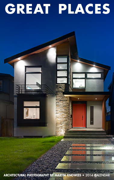
Happy New Year, everyone! If you're a client or friend, this means that you'll soon be receiving (or have already received) this year's Martin Knowles Photo/Media calendar: 2015 Architectural Photo Calendar Cover

...and if you want to make sure you get one, let us know as we'll be mailing out (or hand-delivering, if you're in metro Vancouver) a whole pile the first week of January. This year marks a major milestone: I've been putting a photo calendar together annually for the last fifteen years. Yes, that predates the founding of Martin Knowles Photo/Media. In honour of Throwback Thursday, it's time for a walk down memory lane at past designs. Some of you probably have a full run of these back to the start, and if you do, congrats (and I want to hear from you, because you are one of a very special bunch of people).

The Handmade Era (2001-2003)

2001 Calendar

The first calendar I produced was in December 2000 for 2001, still back in university days. I'd just finished building in a home darkroom as part of a minor basement renovation at my old townhouse in Port Moody, and I wanted a good way to show everyone what the lab space was capable of. While I could do (and often did) RA-4 colour printing out of the space, it was far easier and faster to do a pile of B&W instead of doing colour 2 images at a time. Doing one image for every 2 months meant printing 6 images per calendar rather than 12, and that meant less paper and a cheaper bind at the local print shop. 60 prints (plus make-ready) and a pile of mounting later, the calendar tradition was born, with an edition of 10, all of which went out to family and close friends.

For the next two years, I kept doing this. By 2003, at an edition of 20, I'd gotten tired of being out in the parking lot in the middle of the night on Christmas night spray gluing prints in near-freezing weather, and covering a whole floor of my place with stacks of prints, assembly jigs, and newsprint as the glue dried, so it was time to start doing something better the next year.

The Big Era (2004-2006)

2004 Calendar

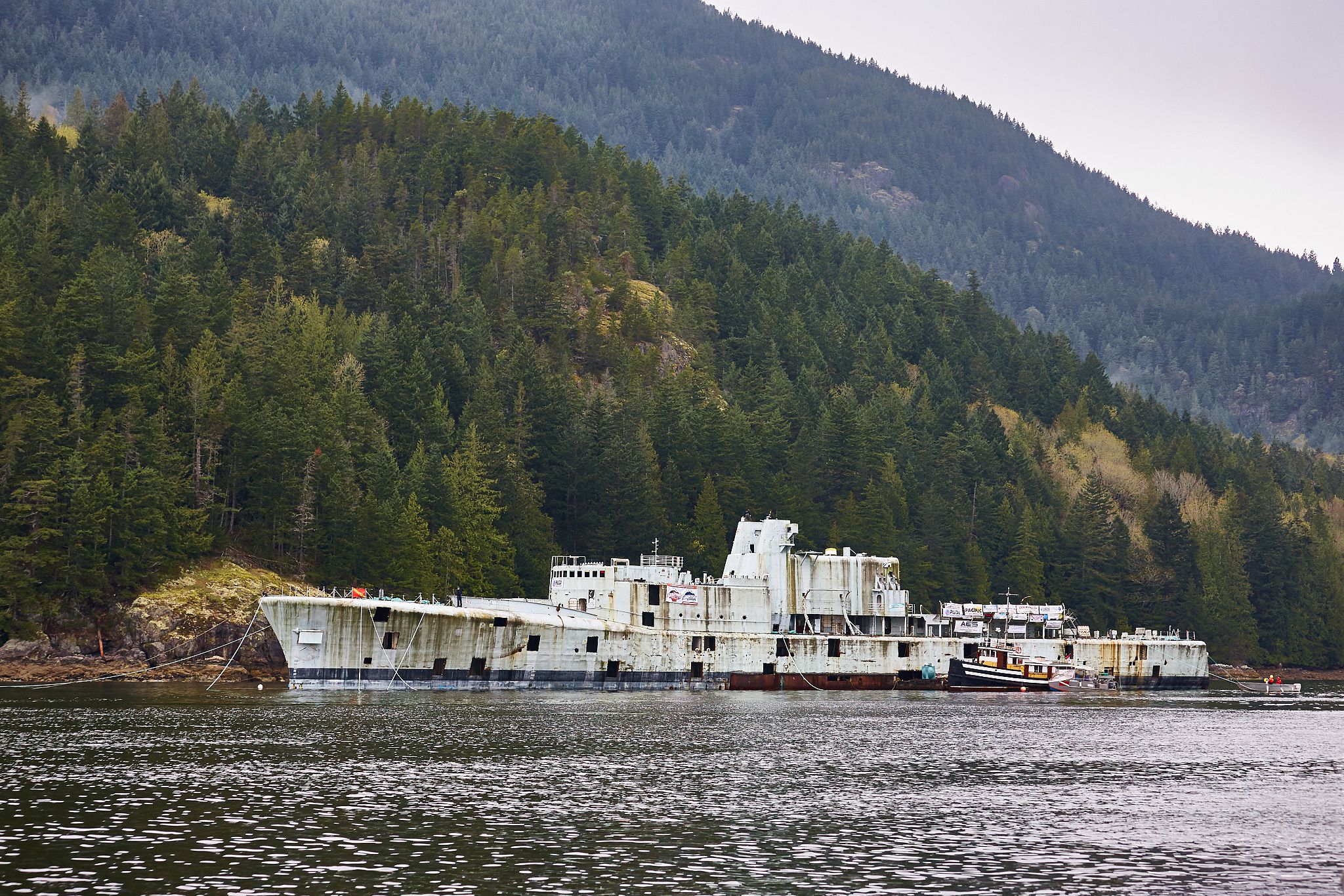
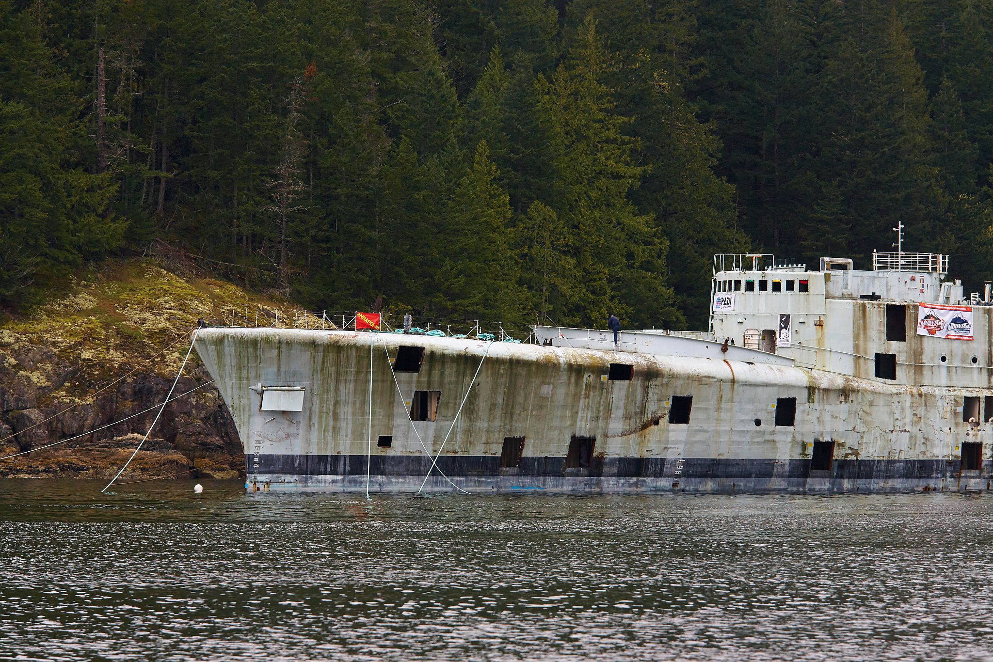
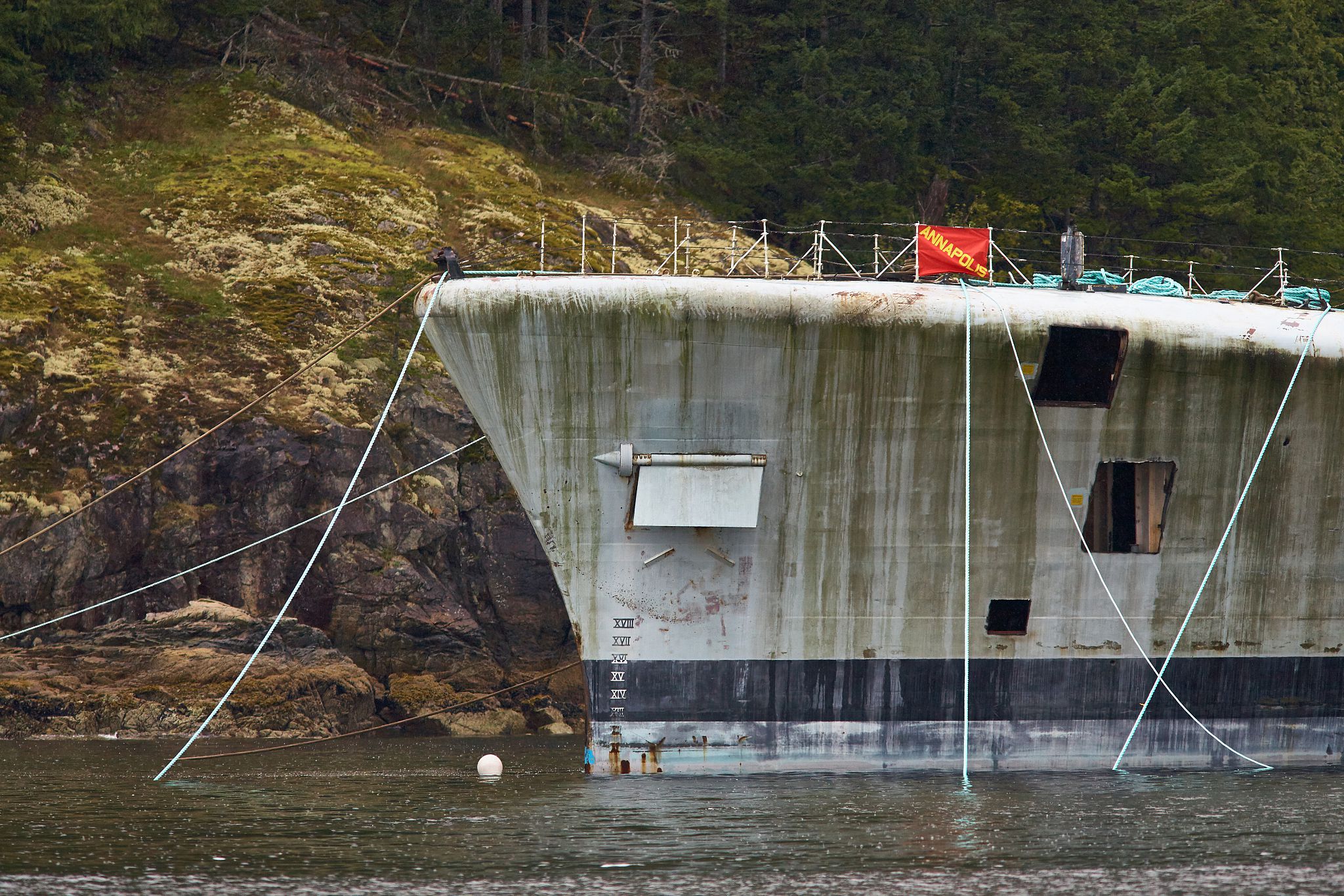
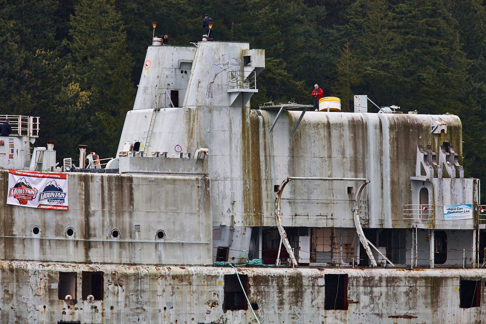
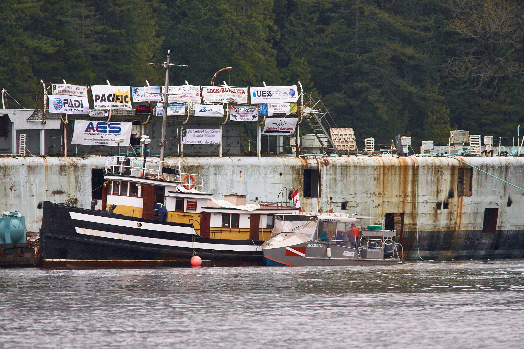
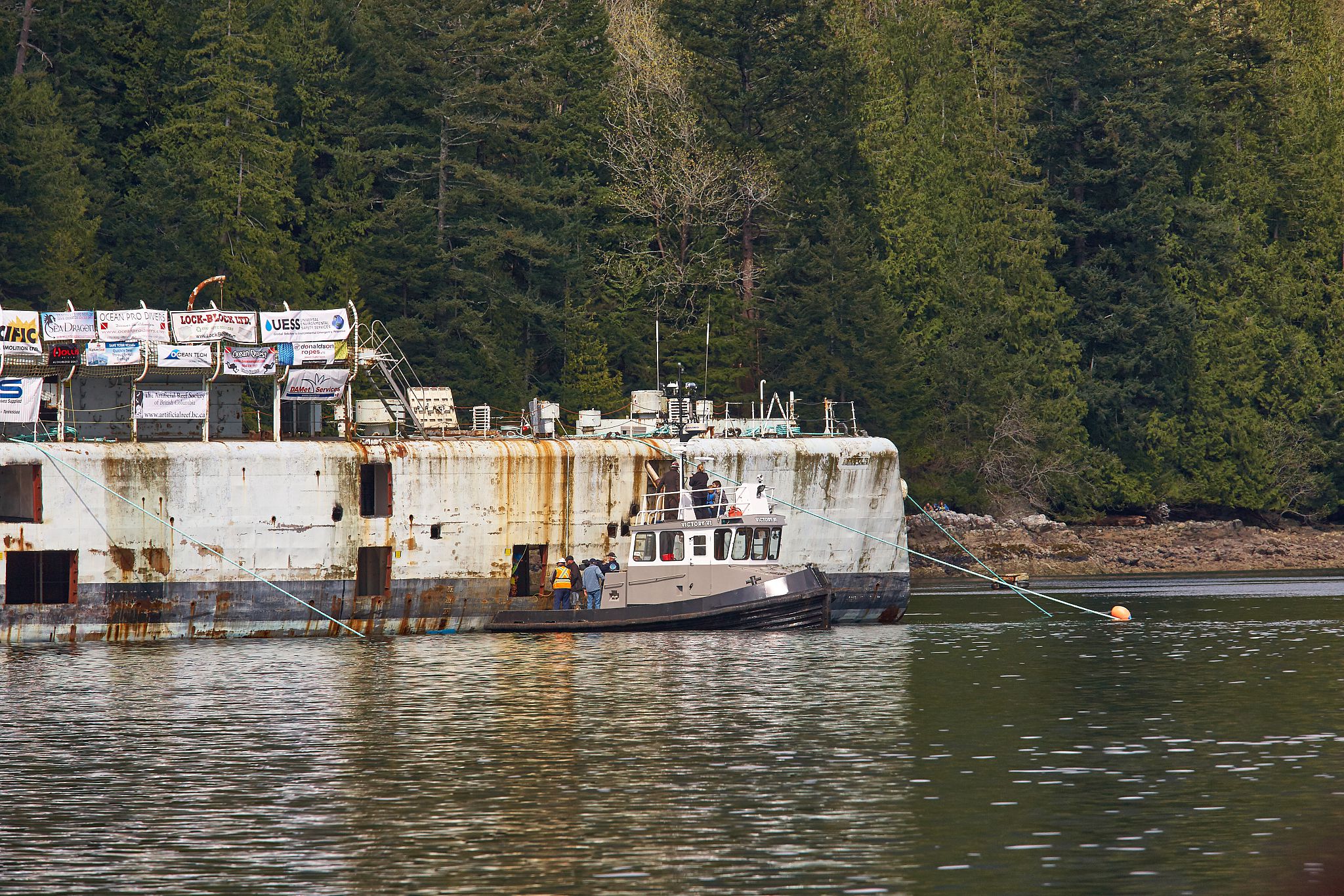
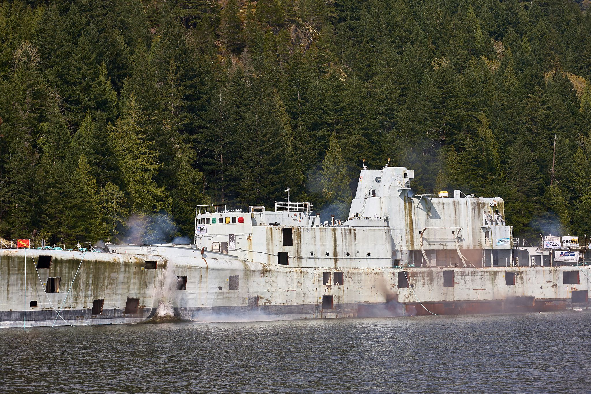
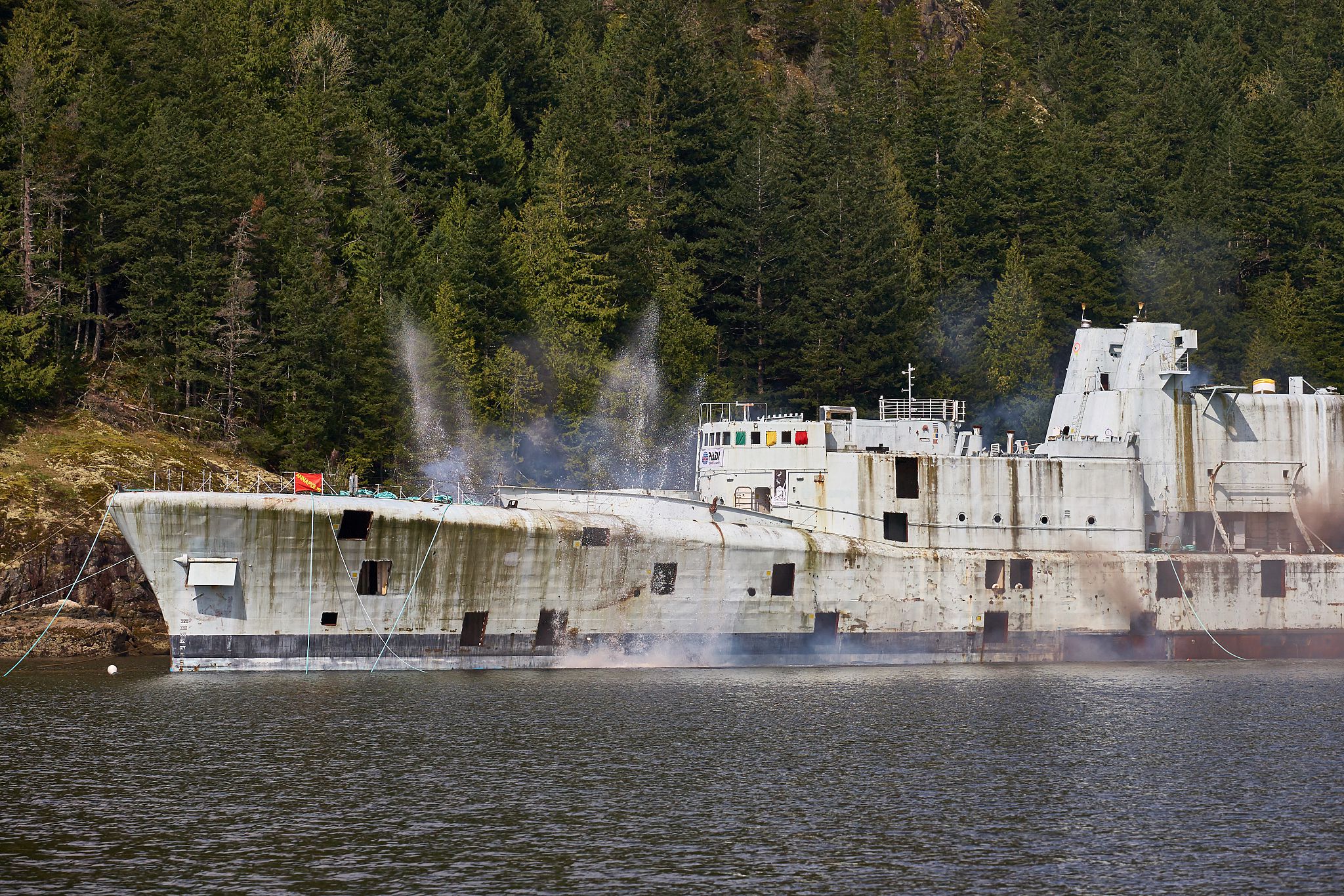
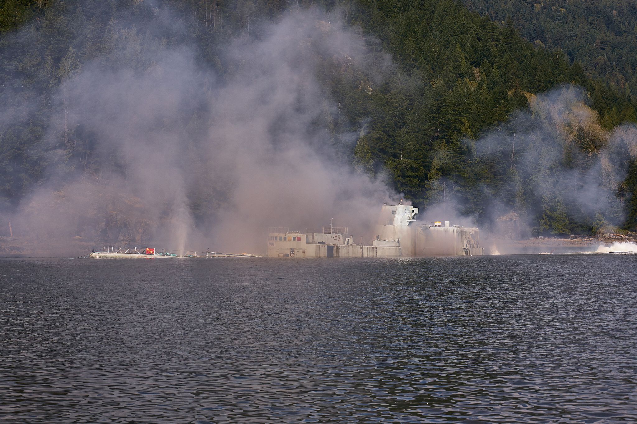
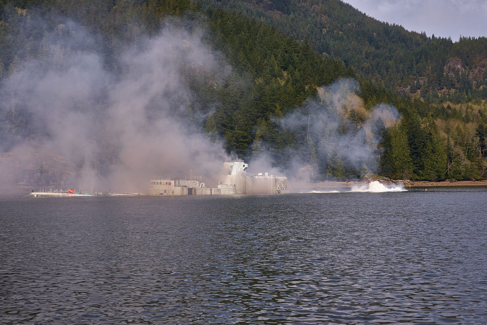
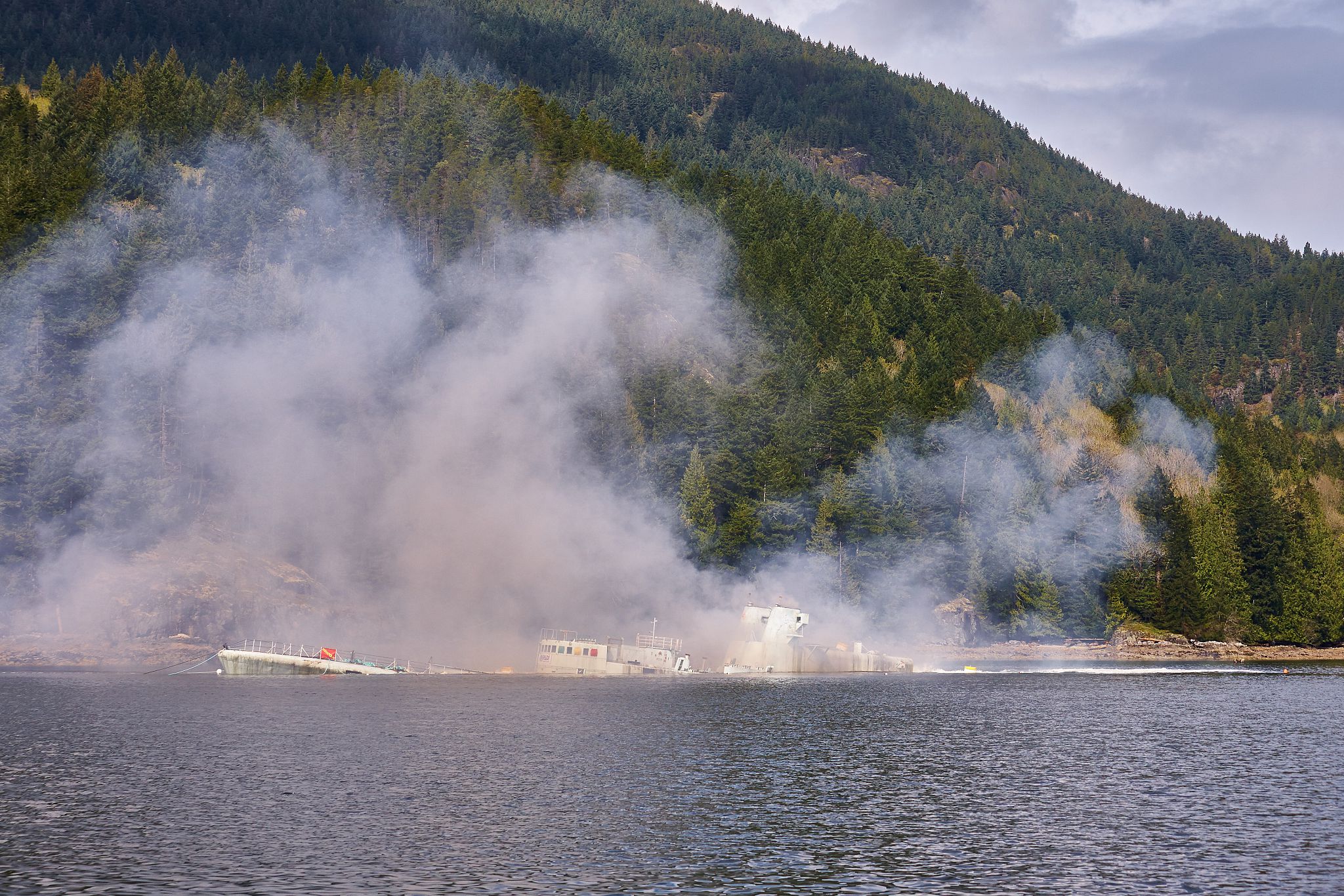
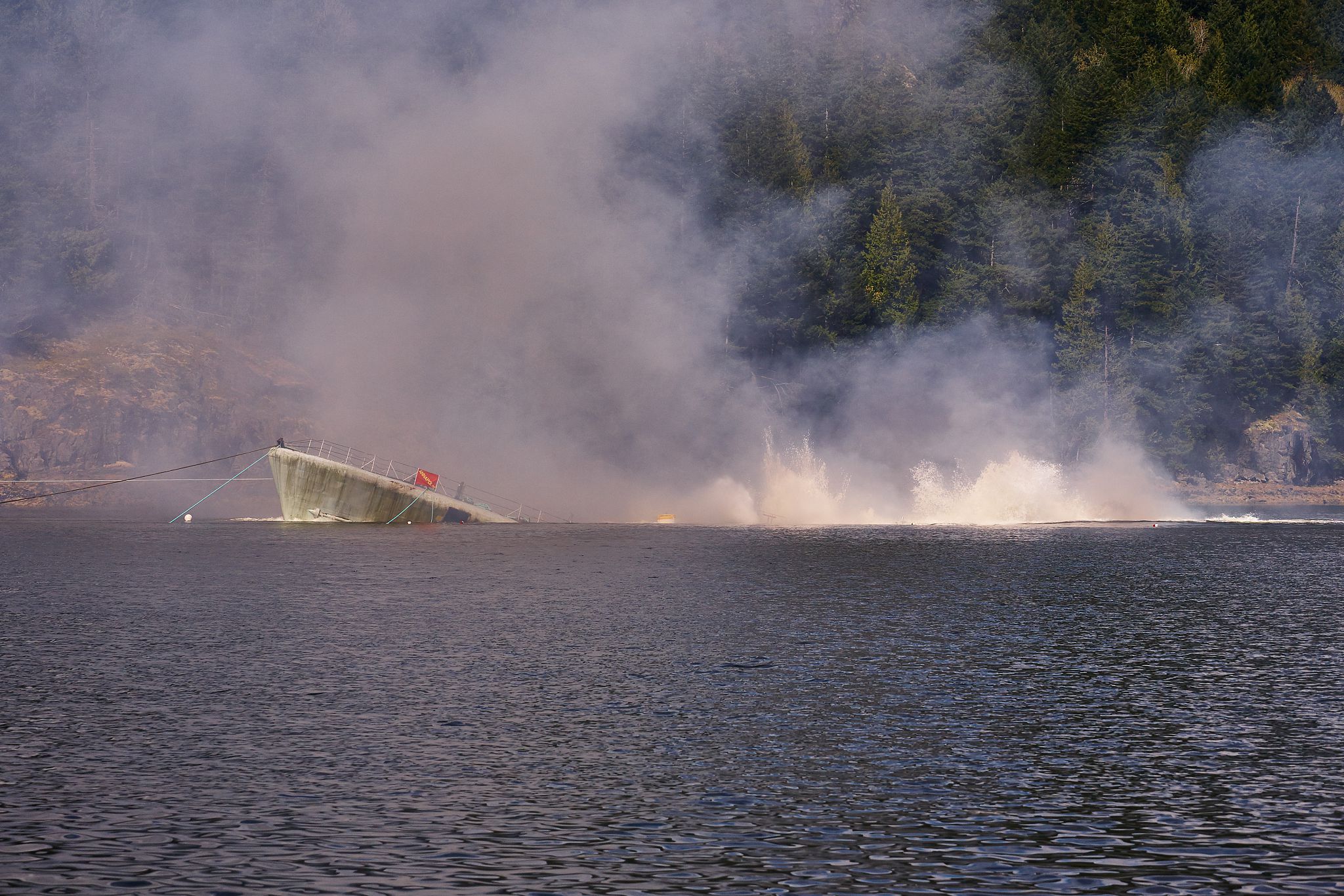
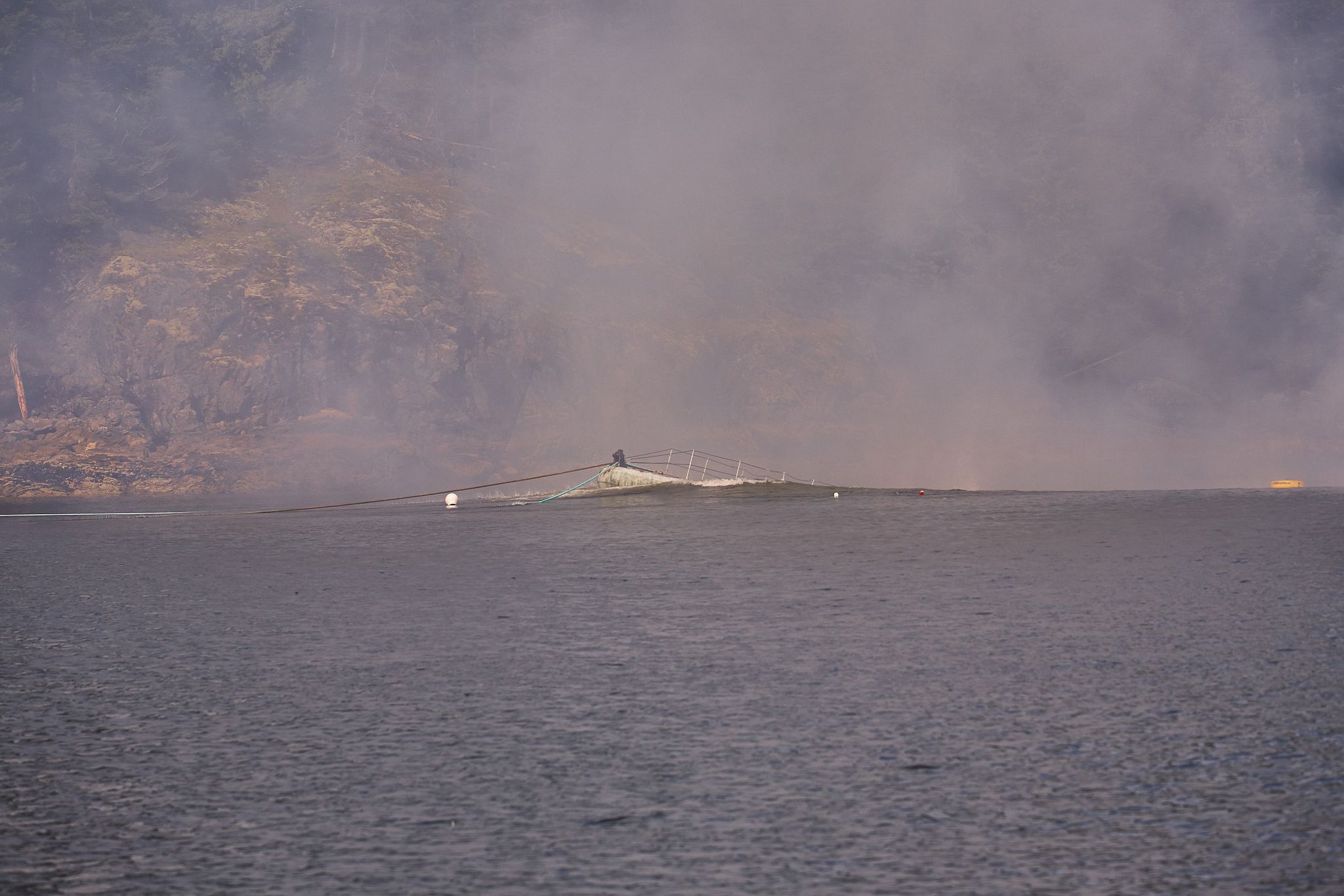
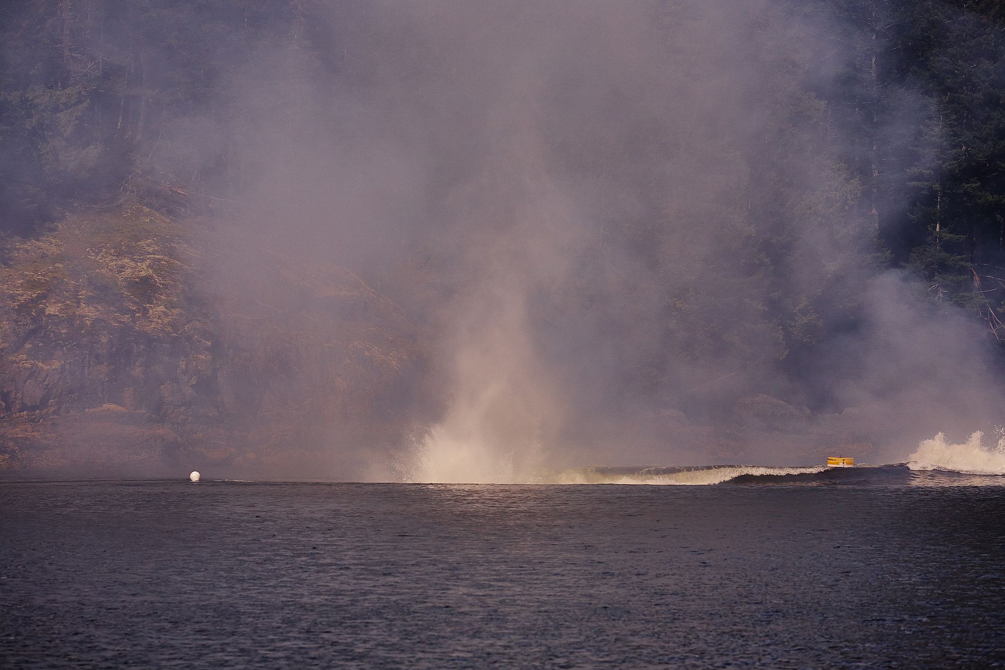
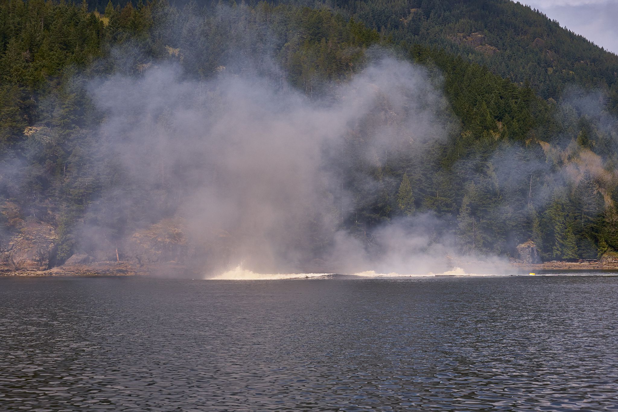
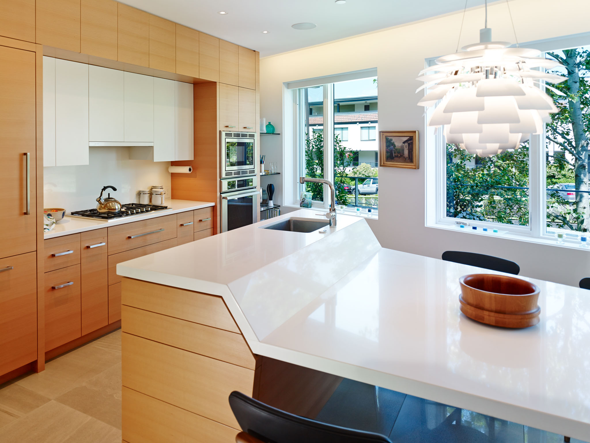
Moving to commercial laser print for the whole job rather than printing in the darkroom was bittersweet: it was far easier, but local printers would do 90lpi digital printing to tabloid paper, tops, which was nowhere near the quality I'd gotten used to printing (largely from 4x5 originals) in the darkroom--and my run wasn't big enough to be able to do direct-to-plate offset. So, to make up for the lower resolution, the images got bigger--so rather than being half pages, the photos grew to a full 8x10. Calendars of this era are also notable for including graphically strong construction progress images (like the one above). I was involved at the time in documenting the construction at the Iona Building at UBC and Christ Church Cathedral downtown, so I had a couple of ready libraries of calendar-worthy, graphically strong construction images to include.

The Inkjet Colour Era (2007-2008)

2007 Calendar

By 2007, I'd moved almost entirely to digital, and I'd acquired a wide-format Epson inkjet printer that naturally needed to be tested out, so...what better way to find out what your ink usage was than to print 40 calendars? During the winter of 2006, I was still working full-time in IT and commuting back and forth weekly between Seattle and Vancouver, and a little side project to blow off some creative juices (and vent my frustrations with doing that commute) was in order, so I went 'back to roots' and printed all these myself...but this time, digitally and for the first time, in colour! I shoot a lot of strong vertical images (which is a good way of ensuring that my clients' projects have a good shot at making the cover of a lot of design magazines), and most of the photos I'd selected for calendar use that year were verticals, so I came up with this layout to show the biggest possible image while saving paper (because 11x17 short grain double side inkjet paper is pricey stuff) and only require one run through the guillotine to cut the paper to size:

2007I got universally positive reviews on this format: it was small enough to fit in a notebook, and thin enough that it would fit on the end of a 2x4 wall or on the A-pillar of a pickup truck--and that's important when you have a lot of builder clients!

The Modern Era (2009-present)

By 2009, Martin Knowles Photo/Media was starting to be in full swing, and we had a big enough client base that I wasn't really relishing having to babysit an inkjet printer as it chugged (and too-often jammed) through a ream of 11x17 paper and a few boxes of seemingly-more-expensive-than-unicorn-tears ink. With direct-from-digital 4-colour printing getting good and cheap enough to be workable, it was time to explore alternatives. I'd met realtor Jan Alexander through the Vancouver Heritage Foundation. At the time, she was printing all her own sales materials, beautifully, and had most of a full-service digital print shop set up in her basement. This was a perfect fit for making the switch to digital print while being able to do the requisite tweaks to colour, bleed, and all the other printing bits in a quick and hands-on way.

For the last few years, I've been printing increasingly large runs (200 this year) of calendars down at Allegra in Surrey. They've been great about doing press checks and responding to feedback when things don't quite work right the first time out (which happens a lot when you're using an unconventional format). Every year I keep asking 'is it time to move to offset litho?', and every year the number of items that can be cost-effectively run on direct digital goes up, so the race is on.

Enjoy your calendars, everyone--and here's to an amazing 2015!

Houzz That!?

Is there anyone out there in the design world who's not yet familiar with Houzz? If you're one of the few who wasn't until I mentioned it, go check it out: it's Pinterest for residential interior design, with discussion groups, a lot of really good (and sometimes not-so-good) photography of interesting residential goodness. In addition to lots of project photos, Houzz publishes a lot of useful editorials. A few weeks ago, this one crossed our email box, and it hits the nail completely on the head: How to Hire and Architectural Photographer. This readable little primer talks about a number of things we often talk to our prospective clients about: including the differences between photographing for architecture and real estate, what to expect when we're on site, the importance of hiring someone who specializes in the built environment (yep, we do both real estate and architecture and love both--but let us know what you need), and other important things. Worth a read.

houzzwindow

As you might guess, we have a profile on Houzz as well, with a goodly number of projects. Check out our Houzz profile, and if you're one of our clients on Houzz with a project we've photographed, let us know so we can link to you.

The Ovation…that keeps on giving!

We've been sponsors of the GVHBA Ovation Awards since before they were called that--and in addition to sponsoring the awards, we encourage our GVHBA member clients to enter as they usually do well--often placing as either award winners or finalists in numerous categories. This year, Kerr Construction was one of the lucky winners, with their phenomenal House of Finn Juhl, a.k.a. Alder Crossing, in the highly competitive Best Custom Home $750K-1.5 million category. kerr-alderxing3499  

This intriguing project involved building a residence into a vestigial corner of a commercial complex near Granville Island, and required all sorts of interesting structural and interior design moves to make a space work on a constrained building site with no right angles and a commercial parking garage underneath. We had a great time photographing the space last summer--working with and around all those angles made for some very careful but rewarding photography work, even more so when top-notch midcentury modern revival furniture is involved. At the Ovation Awards gala, Kerr Construction owners Doug and Susan Kerr were lamenting that they haven't gotten around to getting the media coverage that we all think this project ought to have, given both the result and the back-story. As it happens, one of the benefits of having a lot of work out in the news media is having a lot of connections to help people and projects get the coverage they deserve. On the Monday after the Ovations, one of the writers from Canadian Contractor magazine called me up in a last-minute quandary: she needed a project (or projects) for their 'Creative Eye' section, and since we've been able to connect them with projects for Creative Eye on short notice before, she browsed our website and had a couple of ideas as to the sorts of things she was looking for and was hoping we'd be able to help them out. Remembering the conversation from the gala, I suggested Kerr Construction's freshly-awarded project, and after a number of frantic e-mails and a small frenzy of phone calls, she had her story--and the project landed on the cover of the May/June 2014 Canadian Contractor! Check it out: Canadian Contractor Cover

Pro Tip: Share Your Marketing Efforts

The GVHBA Suppliers' Council (which I chair) hosted a forum this morning where we asked five interior designers and specifiers to talk about what works, what doesn't, and things they'd improve in working with their suppliers. John Friswell of the well-respected local renovation firm CCI Renovations made a great point: since marketing is something we all need to do, it's also something we can share. In the architecture, design, and construction world, many trades and many products go into a building project, and everyone needs to be able to promote their work. For suppliers, it's even more important because people can much more effectively visualize a product that's installed in a project than looking at a product in a showroom--it's all good to have an amazing faucet, but seeing what sink that faucet could pair with, and what tile you can put behind it, elevates the whole design.

You can share marketing efforts in a lot of creative ways. Here are a few we've seen:

  • Builders will often be profiled (or have a project profiled) in a magazine, particularly if a project wins an award. Writers are always looking for a good story, and if you used a particularly uncommon product, make note of the product. The supplier of the product might end up using a detail of your project to promote their product, which leads to them also recommending you as being a particularly good example of what to do with their product and someone who knows what to do with it. More work for both of you!
  • Some products just naturally go together. Cabinets and countertops. Office walls and lighting. Flooring and millwork. Doors and lock hardware. Advertising can be expensive, so why not share the space with a supplier with a complimentary product that you trust and work well with? If a half-page ad is less expensive than two quarter-page ads, buy the half-page ad together and split it. This also makes sure that your product is showing up next to the complimentary product, so you both win. This can also work great for tradeshows; we've seen two smaller suppliers share a bigger booth, which also relieves the pressure on each person running the booth. (If you've been standing for hours at a tradeshow, you know you'd do just about anything to get off your feet!)
  • Share photo shoots. How do you show off a particularly great installation? Through photos, of course. If you can share your marketing with another affiliated party, it brings the cost of photography down for everyone, and each firm gets the images they need.

We make it particularly easy to share the cost of photography with the way we structure our pricing. Ideally, you only want to have us come on site once, because that makes it easier on the owners, so the more we can pack into those on-site days, the better it works for everyone. Since each company is going to be using slightly different images, we charge a combined creative fee for all the on-site work we do, and then charge per image for usage. This saves money for each party because each party has particular needs and probably won't need all the images from a shoot, but they will likely need different images. For instance, if you're a builder and you're sharing costs with your cabinet supplier, you'll definitely be wanting a shot of the exterior, the living room, and the media room as well as the kitchen, but the kitchen supplier will want a half dozen images of the kitchen and bathroom. This also means we can edit the images a little differently: we can make sure that the images for the cabinet supplier bring out the wood grain in the cabinets, for instance, where this might be distracting in shots intended for the builders' more general use.

Stolen gear

I was photographing a place on Angus Drive (between Matthews and King Edward) this afternoon for the Vancouver Heritage Foundation, and in the couple of minutes between when I switched lenses and came back to my bike to hop on and shoot the next house, someone got off their (red, crappy, 1960-1980-era road) bike, hopped on my grey Trek 1000 road bike--with a pannier containing a lens, flash, a couple of miscellaneous cables, tripod, and head--and took off.

If you were this person and are reading this because you took a look at the business cards in my camera bag and are curious as to whose bike and gear you just ripped off, know this: the police are now looking for you. If you're feeling remorse and would like to make yourself whole, let me know and I'm willing to meet on neutral turf somewhere in Vancouver and take everything back, no questions asked. Use that big 'get in touch' button up there at the top of the browser window. (Getting your original bike back is left as an exercise for you and the cops, fellow, ahem, cyclist).

And for the rest of you, here's what to keep an eye out for, should it show up at your local bike shop or camera store:

  •  54cm Trek 1000 road bike, around 2005 vintage. Distinguishing marks:
    - grey aluminum with blue decal highlights
    - yellow 'Bait Bike' sticker, small '1008' number on top of top tube
    - Shimano Tiagra shifters and rear derailleur, Shimano 600 brakes (front + rear)
    - black rear rack
    - carbon fiber seatpost (with ergonomic seat) and carbon front fork
    - black full-coverage fenders on front and rear, rear fender rubber torn
  • Canon 24-105 f/4 IS L lens, s/n 4180400 - with hood but without front cap
  • Canon 580EX flash, s/n 149034, containing 4 Eneloop AA batteries (serial unrecorded)
  • Canon flash extension cord
  •  Canon remote release switch
  • Manfrotto 190XPROB tripod (serial A1900290) with Sirui ballhead (no serial)
  • Blue Tamrac sling-style camera bag

Thankfully, I still have all the images and the camera…and I was on the tail end of the shoot, and I have backup gear for most of this so I'm not out of business.  Could have been far worse.

The bike you're looking for:


Stolen Trek 1000 road bike Vancouver…only with Shimano combo pedals and slightly different shifters.


Stuff for sale! (a.k.a. cleaning out the gear closet)

All this spring-like weather has put me in the mood for a bit of spring cleaning. Since I've recently switched from RC2 plates to Arca-Swiss plates on my gear (RC2 is great, don't get me wrong…but it's a little light when you want to put a tech cam atop an RC2 head and rotate it 90 degrees…). Are you in the market for some better support for your camera, or better ways to carry it? Read on, then. Everything is "or best offer"; I'll be updating this post as things sell.

Manfrotto 804RC2 pan-tilt heads - $50 each

804RC2


I have two of these available, both identical. They're well-used but in great shape, and include the RC2 plate if you need one.

Manfrotto 3216 monopod $40

man3216

"Speak softly and carry a big stick". -Theodore Roosevelt. Also, as a good monopod should, doubles as a reasonable hiking stick. You have your choice of three monopod heads to put on this one; see below.

Manfrotto monopod tilt head $30

tripodbits0244

This is the 'factory' tilt head for the monopod above, or any other long thing with a standard 3/8" screw atop it. (Stop laughing!). Attach bottom part to monopod; attach top part to camera (or light). The knurled knob can be reversed depending on whether your camera/light/whatever takes 3/8" or 1/4". If your gear has an RC2 plate on it, and you don't want to remove it, you probably don't want this. What you want instead is one of these two:

Manfrotto 234RC monopod head ($40) or knockoff ($30)

tripodbits0227


This is the same head as above, but with an RC2 quick-release plate on it rather than a screw.  I also have a generic knockoff version of this, which works identically and looks almost identical. 

Alzo RC2 Camera Flip Plate $40

flipbracket


This flip plate has an integral RC2 plate on the bottom (sense a theme here?) and a lock knob. Unscrew the lock knob, and the plate slides up to 90 degrees. It's a clever way to get most of the advantages of a universal L bracket without the weight/expense. See here for more info--but the photos on Alzo's site are not of the RC2 version, which seems to be discontinued: http://www.alzodigital.com/online_store/alzo-camera-flipper.htm

Generic RC2 Plate Adapter $25

plate


This adapter attaches to a 3/8" or 1/4" screw with bushing (included), and takes an RC2 plate on top. Includes safety latch. This plate adapter safely held my 5D and a tilt-shift lens on a 14' extendable painter's pole on location countless times.

Manfrotto 3405 'Junior' Tripod with 3-way head, $80

product_83830

 This is a surprisingly versatile little tripod with an integral (and non-interchangeable, thanks for asking) pan-tilt RC2 head. The centre column can be pulled out completely for travel compactness (it will fit on the side of regulation carry-on luggage), or inserted upside down for low-point shooting. This tripod got used extensively for construction progress documentation at VST and Christ Church Cathedral, where I wanted a tripod that I could leave on-site and not have to worry much about it if it vanished.

 LowePro TLZ Mini Case $20

tripodbits0287


This cute little case will protect your crop-sensor body with a short zoom on it, and maybe a filter or two and a battery in the external pocket. It's definitely a "travel light" case. This fit an original Digital Rebel perfectly, but my current full-frame bodies are all too fat to fit in this.

LowePro photo fanny pack $20

tripodbits0286


This fanny pack will happily fit a crop-sensor DSLR and a short zoom, plus a couple of lenses + accessories, or a…film SLR (see those elastics on the top of the case? Yep, those are what you think they're for.)

It's calendar time!

calendar14b

It's that time of year. Yes, you guessed it: calendar time! If you've worked with us in the past couple of years, yours will be on the way soon. If you've never received one before and you'd like one, please let us know so we can get one to you. We're continuing with our well-loved "tall and skinny" format that our clients and friends tell us is the Right Size for Everything--it will fit perfectly on the end of any 2x6-framed partition wall, in your cubicle, on the A-pillar of most construction vehicles, in a binder with room to spare, or plenty of other places.

Big shout-out to Victoreric Design Group, Jenny Martin Design, VisionBuilt, Allen + Maurer Architecture, Stephanie Robb Architecture, David Nairne and Associates, and DGBK Architects (via the West Van Museum), for the cool projects to photograph over the course of the year.

A [Vancouver] Special Article

We're proud to be a big part of the article on Vancouver Specials in the September/October issue of Canadian Contractor. It's available in digital edition here. Kudos to our clients Stephanie Robb ArchitectTQ ConstructionQuinton Construction, and our fellow GVHBA member Intermind Design for the good work and good press.

One of the benefits of working with us is getting media attention to your project like this. We often work with a number of architectural/construction-oriented magazines who usually are one the lookout for interesting projects. We'd photographed Stephanie Robb's East 3rd Ave renovation a good while back, and the editor of Canadian Contractor was looking for photos of other interesting Vancouver Specials to flesh out their Creative Eye section. We've photographed a number of Vancouver Specials over the year, and when they wanted one with a creatively refit interior, we naturally thought of TQ's West 22nd project, which we'd photographed for them right before it was featured in the Parade of Renovated Homes earlier this year. A few quick phone calls and emails around later, and...we got several "double-truck" magazine spreads, which we love being part of, and TQ got another opportunity to show off their project, and everyone wins!

Photo of the Week - Campbell Residence

Vancouver Heritage Architecture - Campbell Residence twilight exteriorIt's time once again for the City of Vancouver Heritage Awards, and since our photos have been part of several major awards submissions (among them, Christ Church Cathedral, and the Blanca Street Residence), I thought it entirely apropos to feature this photo of the Campbell Residence, lovingly restored, completed (the entire top floor was mostly unfinished when we first photographed it as construction began) and updated by owner and VHF Founding Pillar Janet Campbell, architect Robert Lemon, and Murray Wystrach Construction. Good work, everyone!

It's always insightful photographing a project like this at steps between initial demolition and completion. We photographed this house annually for the two-years-and-change the house was under renovation, which makes for a nice photo archive for both the current owner, future owners, and anyone wishing later to research the history of the house. Here's how the rear elevation above looked when we first saw it:


Photo of the Week - Fireside Chat

MKPhoto-5015-EditWe're longtime supporters of the Vancouver Heritage Foundation (in fact, I was volunteering for them well before Martin Knowles Photo/Media even existed!), and it's no surprise that having photographed nearly every house tour (and them some) over the better part of the last decade, I have a huge image archive to share with them. This year, they started putting out an email newsletter, and almost every heading image they use is a creative crop from one of my images. I'll talk more about cool cropping tips on this blog later, but suffice it to say: it's always a nifty surprise to see what image they choose and what they do with it.

This is the uncropped version of their newsletter image. Despite the cozy appearance, I photographed this in late summer, with the help of a couple of low-mounted speedlights and a cloudy day. The fire is real, which is a rare treat: normally, we get to Photoshop a roaring fire like that!

Photo of the Week - Buchanan Building Bike Shelter

Bruce Carscadden Architecture - Buchanan Bike Lockup

As many of you know, I'm an all-weather cyclist...and yes, that is my commuter bike (cleaned up for the occasion) serving as a prop. Judging from their recent Bike to Work Week scores, so are some of my clients. This Photo of the Week is brought to you by the letter B: this bike shelter is at the Buchanan Building at UBC, built by the also-bike-brandishing Bruce Carsadden Architects. We photographed this almost exactly two years ago when it first opened, and it's a classic Bruce Carscadden project: combining an awareness of usability, solidity of form, a sense of (as one of their architects put it) thrift and efficiency in materials and expression, and a certain durable playfulness that dresses up what would otherwise be a somewhat banal utility space. 

Photographically, it's an example of the usefulness of winter light. This photo was made with predominantly available light and a small amount of flash fill. While Vancouver weather in December is usually grey, dark, wet, and generally blah, when we do get a few minutes of winter light, it can make for interesting photos if the conditions are right. Winter light (when it happens) is crisp and low, and does a great job of jazzing up a due-south-facing project like this one. The louvers show well in this sort of light, which penetrates deep into the structure to highlight the vertical and horizontal elements that make up the walls of the project.