PSMW Illuminated Modernism

We photographers know a few things about the power of lighting to transform and inform one's experience of built space. One of my favourite ongoing installations during Modernism Week has been Illuminated Modernism. About a dozen and a half historically significant buildings along Palm Canyon Drive have been specially illuminated for the week, both with standard gelled lights (of the sort I'd use to illuminate buildings for twilight exteriors), and with gobos that show the name of the architect and the date of construction for the building. This really changes the way you view the buildings as you drive into or out of town: through the addition of special lighting, a number of relatively banal buildings have become much more attractive, and some already cool buildings have become, well, even cooler. I've been thankful that the special lighting has been running all week, because it's given me several opportunities to go shoot twilight exteriors for the fun of it (you know you're an architectural photographer when you willingly subject yourself to the pressure of shooting twilight exteriors for fun, without a client paying you for it...) without the pressure of having to shoot everything in one night, which would be clearly impossible.

I'm thinking it would be great to do a version of this in Vancouver sometime, possibly for Vancouver Design Week. There would be a number of interesting challenges involved in doing this in an urban environment (apparently in the years they've been doing this, they have had a few Source4's go for a walk). If you think this would be a project you'd want to participate in, please let me know!

Kaptur One

Yes, I successfully passed my Phase One Certified Professional training from last week (which, naturally, includes a bunch of really cool Capture One tricks). And no, I did not, I repeat, not go on a tour of Hugh Kaptur-designed homes in Palm Springs just for the sole purpose of cracking the pun that appears as the title of this blog post. Yeah, right, you're saying.

OK, fine. Enough of that, and on with the photos.


This was a curious tour, since it was largely tract homes (and one that's more in keeping with Kaptur's commercial work). Much like the Vancouver Heritage Foundation's Vancouver Special tour, when everything is a similar housing typology on a similar plan, the fun becomes sussing out differences in renovation, planning, and interior design practice. There were two (and possibly three, depending on how you count) duplicated plans in this tour, as well as several unique places. I had a clear favourite, and you can probably guess which one it is (the walls and the kitchen give it away). Dangerously, that particularly notable place is for sale...for the ridiculously cheap (at least by Vancouver standards) price of $459,000.

Car-chitecture

Palm Springs Modernism Week, besides having a lot of events on its own, has several "sidecar" events, including an art show, midcentury fashion shows, a classic renovated Airstream trailer show (that's Saturday, and I might just take a look at it...for the joy of photographing in really teeny spaces), and a classic car show. When I was wandering over to a furniture/accessories tradeshow just to satisfy my curiosity, I stumbled upon the car show. I'm normally not one to appreciate many aspects of car culture. However, just like people who own heritage houses, I was impressed with the level of detail, care, and love people put into restoring these classics...from the era when efficiency wasn't the paramount concern, and cars could be legitimately viewed as sculpture on four wheels. So, here's the whole show in one collage. You'll probably want to click to zoom. Palm Springs Modernism Week Car Show - in one image

Mecca for (Midcentury) Moderns

This year, I'm finally doing Palm Springs Modernism Week. I've been desparately wanting to go for the last couple of years after local architect Don Luxton told me about it, and this year I got myself on the mailing list early enough to be able to get tickets for some of the interior tours--which, as everyone who's a fan of midcentury modernism knows, is where most of the juicy architectural and design goodness is. I have a full schedule ahead, but I got off to a great start today with the opening Signature Tour, which featured a number of marvellous places, including a "bonus house" next to one of the tour houses. The "bonus house" wasn't officially on tour, but it was for sale, and an enterprising local realtor took the opportunity to get a lot of design enthusiasts through their meticulously staged listing, and probably sell it faster. (Local realtors, take note, if you have a place that's on the route of a self-guided house tour). Highlights:
  • Experiencing Donald Wexler's (former) family home, largely from the outside. Almost all of the bedrooms, and the terrific master ensuite, were closed to tours from the inside. But wait! There isn't a single curtain in the place, there's glass all over, and there's a pathway along the outside. So, you can experience the place as an architectural vitrine. This place admittedly would have been just great in the evening. (In fact, that's when Julius Shulman and Jurgen Nogai photographed it. I'll have to go look at the 'Julius Shulman, The Last Decade' book on my bookcase when I get home and see if it's there).
  • The working 70's era built-in toaster and built-in Brewmatic at a Lawrence Lapham house (which featured nary a right angle in the entire place). I've yet to see a built-in toaster in a new place, but the Brewmatic is one of the progenitors of having a built-in espresso machine, which Miele and others make (and I've photographed in a number of new houses).
  • The William Kreisel "Pod House". The whole master bedroom, closet, and ensuite double bathroom was something else...and the peek-a-boo sight lines and level changes through the place separated spaces in a very clever way. Not a house I'd want to live in, but it was certainly fun to wander through.
  • The first Krisel house in Twin Palms, affectionately renovated by its current owner. Sadly, said owner didn't allow interior photography, so I couldn't shoot the master bedroom and ensuite, which were one of the major highlights of the place.

As Joe McNally would say, 'more tk'. There are enough events, tours, walks, and other goodness that even if I had unlimited budget (or media accreditation), I'd likely still end up with a bad case of FOMO.

Credit Where Credit's Due

Florian Maurer, architect of the marvellous Sloan/Berkes Residence featured on the front cover of our calendars this year, pointed out that the back-of-the-calendar credit is incorrect. The correct credit should be to Allen+Maurer Architects, Ltd. Apologies for the confusion, everyone! And if you're curious about the project, the house is featured over on Houzz (and will soon be up on our site). It's well worth a look, if you haven't already done so:

Throwback Thursday: 15 Years of Calendars

Happy New Year, everyone! If you're a client or friend, this means that you'll soon be receiving (or have already received) this year's Martin Knowles Photo/Media calendar: 2015 Architectural Photo Calendar Cover

...and if you want to make sure you get one, let us know as we'll be mailing out (or hand-delivering, if you're in metro Vancouver) a whole pile the first week of January. This year marks a major milestone: I've been putting a photo calendar together annually for the last fifteen years. Yes, that predates the founding of Martin Knowles Photo/Media. In honour of Throwback Thursday, it's time for a walk down memory lane at past designs. Some of you probably have a full run of these back to the start, and if you do, congrats (and I want to hear from you, because you are one of a very special bunch of people).

The Handmade Era (2001-2003)

2001 Calendar

The first calendar I produced was in December 2000 for 2001, still back in university days. I'd just finished building in a home darkroom as part of a minor basement renovation at my old townhouse in Port Moody, and I wanted a good way to show everyone what the lab space was capable of. While I could do (and often did) RA-4 colour printing out of the space, it was far easier and faster to do a pile of B&W instead of doing colour 2 images at a time. Doing one image for every 2 months meant printing 6 images per calendar rather than 12, and that meant less paper and a cheaper bind at the local print shop. 60 prints (plus make-ready) and a pile of mounting later, the calendar tradition was born, with an edition of 10, all of which went out to family and close friends.

For the next two years, I kept doing this. By 2003, at an edition of 20, I'd gotten tired of being out in the parking lot in the middle of the night on Christmas night spray gluing prints in near-freezing weather, and covering a whole floor of my place with stacks of prints, assembly jigs, and newsprint as the glue dried, so it was time to start doing something better the next year.

The Big Era (2004-2006)

2004 Calendar

Moving to commercial laser print for the whole job rather than printing in the darkroom was bittersweet: it was far easier, but local printers would do 90lpi digital printing to tabloid paper, tops, which was nowhere near the quality I'd gotten used to printing (largely from 4x5 originals) in the darkroom--and my run wasn't big enough to be able to do direct-to-plate offset. So, to make up for the lower resolution, the images got bigger--so rather than being half pages, the photos grew to a full 8x10. Calendars of this era are also notable for including graphically strong construction progress images (like the one above). I was involved at the time in documenting the construction at the Iona Building at UBC and Christ Church Cathedral downtown, so I had a couple of ready libraries of calendar-worthy, graphically strong construction images to include.

The Inkjet Colour Era (2007-2008)

2007 Calendar

By 2007, I'd moved almost entirely to digital, and I'd acquired a wide-format Epson inkjet printer that naturally needed to be tested out, so...what better way to find out what your ink usage was than to print 40 calendars? During the winter of 2006, I was still working full-time in IT and commuting back and forth weekly between Seattle and Vancouver, and a little side project to blow off some creative juices (and vent my frustrations with doing that commute) was in order, so I went 'back to roots' and printed all these myself...but this time, digitally and for the first time, in colour! I shoot a lot of strong vertical images (which is a good way of ensuring that my clients' projects have a good shot at making the cover of a lot of design magazines), and most of the photos I'd selected for calendar use that year were verticals, so I came up with this layout to show the biggest possible image while saving paper (because 11x17 short grain double side inkjet paper is pricey stuff) and only require one run through the guillotine to cut the paper to size:

2007I got universally positive reviews on this format: it was small enough to fit in a notebook, and thin enough that it would fit on the end of a 2x4 wall or on the A-pillar of a pickup truck--and that's important when you have a lot of builder clients!

The Modern Era (2009-present)

By 2009, Martin Knowles Photo/Media was starting to be in full swing, and we had a big enough client base that I wasn't really relishing having to babysit an inkjet printer as it chugged (and too-often jammed) through a ream of 11x17 paper and a few boxes of seemingly-more-expensive-than-unicorn-tears ink. With direct-from-digital 4-colour printing getting good and cheap enough to be workable, it was time to explore alternatives. I'd met realtor Jan Alexander through the Vancouver Heritage Foundation. At the time, she was printing all her own sales materials, beautifully, and had most of a full-service digital print shop set up in her basement. This was a perfect fit for making the switch to digital print while being able to do the requisite tweaks to colour, bleed, and all the other printing bits in a quick and hands-on way.

For the last few years, I've been printing increasingly large runs (200 this year) of calendars down at Allegra in Surrey. They've been great about doing press checks and responding to feedback when things don't quite work right the first time out (which happens a lot when you're using an unconventional format). Every year I keep asking 'is it time to move to offset litho?', and every year the number of items that can be cost-effectively run on direct digital goes up, so the race is on.

Enjoy your calendars, everyone--and here's to an amazing 2015!

Merry Christmas...and to all a good BTS!

This past year, Christ Church Cathedral has been celebrating the 125th anniversary of its founding. One of many celebratory occurrences has been the acquisition of the classic crèche scene from the old Woodwards department store, which was formerly sometimes on display at The Bay. In addition to singing in the choir and serving on many committees over the years, I've often been responsible for architectural photography of the space and things in it--and with two (and soon to be three) renovations at the Cathedral since I joined in 1998, that's been an important ministry as well as leading to all sorts of other interesting work. This time last year, I got the opportunity to photograph the crèche--since at that point we weren't sure what its future was going to be. It's since been donated to the Cathedral officially by the Bay, ensuring that it will be on display in a happy and appreciative home. Cathedral Creche

There are a bunch of challenges involved in photographing the crèche, largely owing to the small space it's displayed in. Since the west alcove is only scarcely larger than your average bathroom, that's a lot of stuff for a small space--and a lot of extra light to carefully pack in and, likely, remove in post. That of course took a good couple of hours of carefully placing and flagging hot lights to bring out the detail in the wood. It's not just a group portrait executed in wood--a lot of the detail isn't in the faces, and getting that out was an effort powered by a half dozen PAR hotlights.

The more interesting challenge was getting light on the 'Mary' window after hours. Since I wanted control over all the light, I had to shoot the crèche after hours (which since it's winter, only means about 4pm). However, from experience (being bored during all those committee meetings!), I knew that light pours through the Mary window at around 11 each day as the Hyatt next door essentially functions as a gigantic bounce card, dumping nicely filtered, coloured, and angled light onto the west alcove. I thought it would be neat to incorporate this light into a photo of the crèche...but that wasn't going to happen after hours without putting a remote flash outside and creating that light myself.

Which I did, thanks to my assistant Andre holding a RadioPopper-equipped flash on a long pole atop an extension ladder outside. Amazingly, there was enough signal getting through the window and heavy stone wall to (most of the time) trip the flash.

_MG_9852

If you haven't been by the Cathedral yet to look at the crèche in all its glory, it's worth a visit. It will be on display until January 6, so check the Cathedral's website for hours and stop in. Merry Christmas, everyone!

Night Shots: Twilight Exteriors

Yesterday was the Winter Solstice, which means that beginning today, every day gets about 15 seconds more sunlight! In honour of that, here's a Pecha Kucha-style talk I did at GVHBA Suppliers' Council a couple of months ago on twilight exteriors--which are a lot more difficult this time of the year because we have so little time in which to shoot them. Golden hour exteriors are, of course, much easier if your building faces south because we get that low golden winter light all day. That's assuming it's not cloudy and rainy. Watch:

How To Win a GVHBA Ovation Award

Are you looking to submit a project for the Ovation Awards? We've been there since...well, the Ovation Awards were called the RenOvation awards, and every year we have a number of projects in the finalists' and winners' circles. If it's your first time entering, we know it can be a bit of a bewildering process if you've never put a project in for an award before. If it's your second, third, fourth...you're probably looking for some tips! Check this out:

Deck The Halls...or not!?

It's December, and that means the holidays are right around the corner...already. That probably means there's some holiday decorating in your future--and if you aren't decorating, your clients probably are. I live in a tiny downtown loft, and while my place certainly has the height for a tree, it doesn't have the floor space, which means I'd be hanging a tree upside down from the ceiling fan. I can hear the meows of encouragement from my cats right now on that one (and the sound of my landlord using my damage deposit refund cheque for wrapping paper, at the same time). So I get to keep it simple and enjoy what other people do with their places, living vicariously when I'm visiting with a camera. Besides decorating, one of the other great holiday traditions is...wait for it...saving things until the last minute! Or, taking pleasure in being that annoyingly well-organized person who's always bragging to your friends that you had your Christmas shopping all done before Hallowe'en. Here's a protip: if you want your photo to appear in holiday issues of your favourite design and shelter magazines, you want to be a few steps further ahead of the holiday rush than people in the "get it all done before Hallowe'en" crowd. Yes, I'm saying: if you have a seasonal project, get us to do your "holiday" photos now so you can be ready for the holidays NEXT YEAR.

Why so ridiculously early, you ask? Let's say you're a magazine that publishes bimonthly or quarterly, as a lot of high-end home and shelter magazines do. That means you have a November/December or December/January "holiday" issue, or a November-February "winter" issue which needs at least a few pieces of holiday content. Magazines have a month or more of 'lead time' before they go to press, which means putting together your holiday issue in September or October. This year back in October we'd just licked the last of our Georgie Awards shooting and had such generally bright weather that aside from fall colour, we could still pretty much make a place look like it was still midsummer. And back then, nobody had their Christmas decorations up yet. So what's an editor to do? You can of course put a bunch of holiday decorations up as staging and shoot them, or Photoshop them in, but both of those things are labour-intensive and expensive because you're going to have to commission someone to do all that (virtual or real) decorating, and then hire me to go out and photograph it as a special project. Or, if you're like most magazines that prefer to use submitted content rather than photographing their own articles, you're stuck with using projects that were photographed last winter. That way, by the time faithful readers are sitting by a fire watching the snow come down and catching up on a year's worth of periodicals, you can show images that look like you could magically move yourself in without even getting up out of your cozy chair.

Cozy holiday fire, shot last November

Like that. And the only way to be the project that the editors pick for that issue is to have your images all ready for an early fall deadline is to shoot your project now and keep it around for next holiday season. You don't have to worry about being picked on for being ready too soon: editors and media folks will in fact love you for being ready and providing them with images that will work when they're desperately in need of them. The image above was part of a shoot for the Vancouver Heritage Foundation's regular article in Homes and Living Vancouver,  shot...you guessed it...a year in advance. So, you have our full permission to be that person who's overly well-prepared. We'll even help with it! How cool is that?

Now, it might happen that you find yourself in the opposite situation: it's the holidays, but you're wanting to shoot non-holiday interiors and exteriors...possibly for your Ovation Awards entry, and you're an early bird so you don't want to wait for the new year to shoot for a January 19 drop-dead date. Your client decorated for Christmas, but you (and the judges, presumably) don't want to see the decorations in the photos. What are you going to do?

You have a couple of choices. Depending on how movable the decorations are, it might be your easiest option to wait until just after Christmas...and remember that giving your client a steady hand and an extra person on a tall ladder after Christmas to get their decorations down faster for a shoot could be really good customer service move on your part; just remember to bring the rum and eggnog or other seasonal beverage for when you're done! It's looking like we'll have a few days that are presently open for shooting right after Christmas, so for a lucky few of you who can coordinate this, the option's open.

Your other option, of course, is to temporarily take their decorations down and reinstall them, or work around them. This works quite well if the decorations lend themselves to moving and temporary pulling down and putting up, but it does require a bit of advance planning, care, and time, since you don't want to be the one who breaks the irreplaceable ornament off great-great-grandma's tree. A few years back, I did a series with the team at Gogo Telugo of about a half-dozen interiors for a local interior decorating firm where the only time we could actually shoot was the week before Christmas. Since we knew we were going to have to un-decorate and re-decorate for almost every interior, the designers would go in an hour or so before I came in, pop off a quick set of iPhone shots of the decorations so we could remember where everything went, and pull the decorations into a room that wasn't going to be photographed. I'd shoot the project, then while I was packing gear up and heading to the next project, they'd hustle around like a set of magical Christmas elves reinstalling all the decorations. And repeat. This was a bunch of extra work, but it did mean we had everything all ready to go by the time they wanted to relaunch their website for the New Year!

Ovation Awards Photos: The Specs Have Changed!

We're a sponsor (and a big fan) of the GVHBA Ovation Awards for Metro Vancouver-area residential projects, and this year's call for entries went out a couple of weeks ago. Hidden in the large pile of paper (or lengthy PDFs, if you're flipping through online) that makes up the call for entries are a number of photo-related goodies and things to be aware of. If you're like most people, you zipped right by the photo specs on the way to seeing which of your projects might qualify and in what categories. As an architectural photographer, I of course perused the photo specs first, and noticed that they've made a bunch of solid changes this year that will affect how you prepare your entries and give you a lot of room for showing your project better and more creatively. Here's a rundown of what to be aware of, and what the consequences are:

  • File size rather than image size requirement. In past years, you've needed to submit images with a particular image size and resolution (it's been 2400x3000 for the last couple of years running). This year, they've dropped this in favour of a file size requirement of 5 megabytes. This is easy to check for: pull up the Finder (if you're on a Mac) or Windows Explorer (on Windows) and check to make sure that all .jpg files you submit are less than 5MB apiece. Notably, there is no minimum size, but we would suggest targeting something in the 2400x3000 range as that will generate a good 8x10 print at 300dpi. How you do this, and what you size to, can get complex, and it has a number of implications for how you submit. More on that in just a bit.
  • Any aspect ratio goes. Since there is no image size requirement, any good printable-at-a-reasonable-size-at-300dpi image will work at any aspect ratio. This means that if you have a 'widescreen' view of your project, you could now submit this, where you haven't been able to in the past. It also means that we don't have to crop your images to a particular size, and can compose at whatever aspect ratio as will show off your project the best. Having said that, as long as the Georgies and the SAM Awards require fixed image sizes, we'll probably still compose most of your images to fit an 8x10 print without much/any cropping. There are a number of places where going wider, taller, or square will help tell your project's story and possibly save you having to submit an extra image to show some detail that would show up on the edge of an image but have to be cropped otherwise. For example, this year you could submit an image like this:
    Ovation Awards Wide Sample

    ...whereas in past years, you'd be forced into a crop that would either emphasize the living room, or most of the kitchen, but not show how both relate:

    Ovation-Wide-Crop-A Ovation-Crop-B
  • You now have a "choice" photo. Some of you have likely had the experience of sitting at the Ovation Awards gala, having your finalist project come up on the screen, and wondering "why for the love of all things good and holy did the judges choose that shot when this shot was clearly better!?" (Then you got your award, had a celebratory beverage, and forgot all about it except for that little lingering bit of "what was I on about?" the next day.) The GVHBA heard us all: you can now indicate what image is your choice for marketing purposes. Think carefully about this: the choice photo is probably going to be the one that tells the best story about your project in one photo. On the flip side, it might be the 'coolest' shot of the lot--maybe it's your twilight exterior if you're submitting in a category that will let you submit one.
  • Video is permitted, but only in the Technical Innovation category (39). Category 39, better known by the mouthful Excellence in Technological Innovation in Residential Construction, is very cool. As chair of the GVHBA Suppliers' Council, I am pleased to point out that it's the only category where suppliers can enter as the primary entrant (provided you get a GVHBA builder/renovator to sign on with you as primary associate). It's also the only category where video is permitted. Let's say you're submitting a project that includes a fold-out corner cabinet design. You can and should show how this works in several photos, but the full impact might be better shown by a 15-second video, particularly if the thing you're submitting is innovative in its assembly or other not-obvious-in-a-still-photo way. We're happy to shoot and edit that little piece of video for you, for an extra charge (and about an extra half hour on site)--just let us know that you're entering this category and we'll talk it through.

What does all that file size gibberish mean?

If you have photos already that you might be considering submitting, you might have just checked them and found either that they're a lot bigger than 5MB, or a lot smaller. What to do?

  1. You have images that are way bigger than 5MB. Earlier in this article, I advised you to target a resolution that's around 2400x3000. If you're looking at the full resolution images we provide you, you'll probably find that they're often around 7000x5000 and tip the scales at 10-15MB. You have three options: 1. downscale them to something that will fit under the 5MB bar, 2. crop them down to something that will fit, or 3. dial down your JPEG quality settings and re-save until the image fits. Of these, we'd recommend one of the first two options. If you want to show everything in the image, then by all means downscale them--you'll preserve the composition of the image, and a lot of the detail. (It might actually enhance some of the detail depending on how you do it). If you have a large image where the important part to your story is a lot smaller, cropping the stuff you don't want to show is a good way to start--particularly because you don't have to crop to a particular aspect ratio, so you can take a nice tight crop that just shows what you want. We do not recommend taking option 3 because that gives you the worst of both worlds: you lose a bunch of your image detail, and you have a big image that makes the judges' life more difficult for no good reason.
  2. You have images that are way smaller than 5MB. Check the image resolution. If they're around 2400x3000 or larger, you are good to go. As an aside, it's entirely likely that you may run into an image that's a lot larger than 2400x3000 but is still well under 5MB, and that's OK. JPEG files use "lossy" compression, which means that large areas of your image that are close to the same colour, like white drywall and clear blue skies, compress well whereas detailed areas like grass and fabric occupy more space. If your image is much smaller than 2400x3000 (for instance, you're considering re-submitting your Georgie images for the Ovations), you're technically fine, but it's not ideal because you could be submitting a larger image with more detail, and the judges might zoom in on an area and wish to see something that isn't there but would be in a larger image. So if you have a larger version of your image, why not take advantage of the extra file size and show more of the fine detail that often sets your project apart from the pack? Do not upsample your small image to make it larger--this will introduce noise and artifacts needlessly. You're better off submitting a clear lower resolution image than a fuzzy higher resolution image, but a clear higher resolution image (which you can likely get from your photographer, or from resizing a higher resolution image) is the best.

Also, requiring 5MB images will mean that if you're on a slow connection, your images will take a few minutes to upload. And so will everyone else's, which is going to put a bit of load on the submission servers if you're hitting the last minute before the deadline. Yet another reason to enter early if you can.

Wow...this is stinkin' complex. Can I just call you and get it all taken care of?

Yes, you can! In fact, we'd recommend it. If you have full resolution images in your files already, we can take care of all this and size them so that you get the most from your images while still fitting in the submission requirements, for a nominal fee. If we made the photos that you're going to submit, we include image prep as part of our awards packages, so you can call us up and not worry about it. We're happy to take care of it all for you, since we practically live and breathe this stuff. And if you're going to submit a project and haven't had us photograph it yet, what are you waiting for?

Coming Back for a Visit

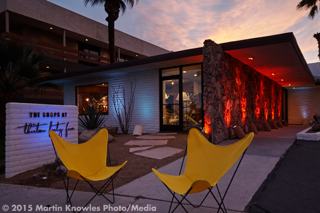
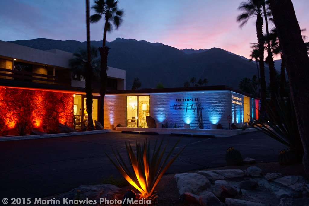
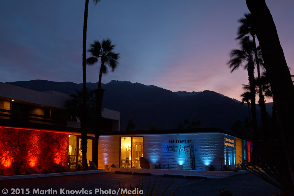
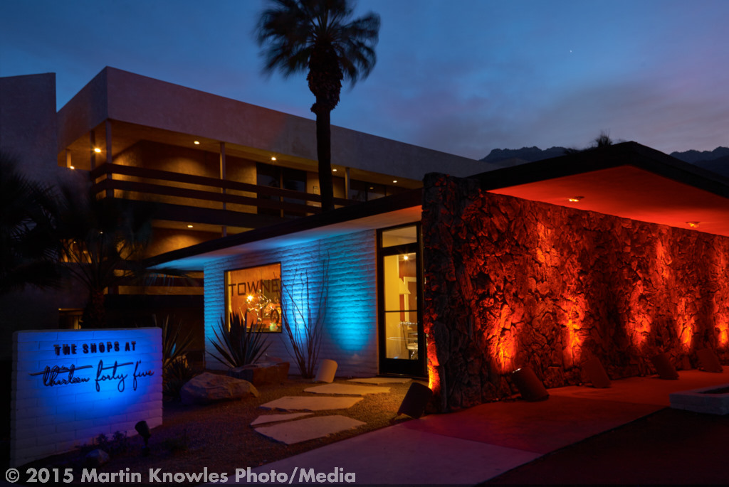
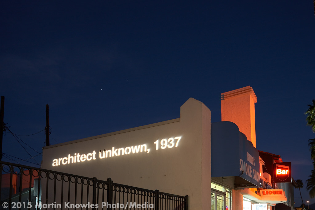
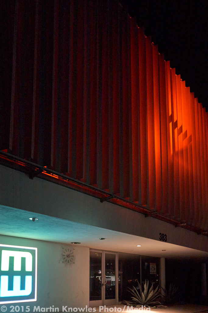
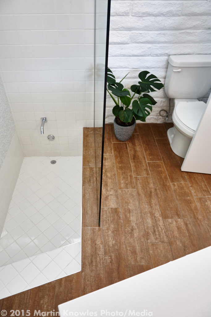
How about a little ghost story in honour of Hallowe’en? Here's an architectural one, from Enon Hall, a marvellous blog that tracked the DIY rehabilitation of an old family house in Virginia. After reading the Enon Hall blog a few years back, I picked up a copy of Genghis Angus' CD 12 Days whence the track comes, and the disc contains a couple of good tracks about heritage buildings (this, and Dust of Progress). Not surprisingly, band leader Allen Kitselman is now a practising architect; he gave me permission to post a link to the song since the CD is now long out of print. Listen here.

All the souls who have lived in this house come back for a visit press their faces against the glass to see what we've done with the place

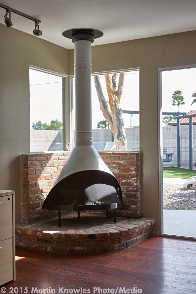
Music aside, one of the most rewarding parts of being an architectural photographer is actually getting to be the “ghost that comes back for a visit” and re-visiting and re-photographing an old project. While a lot of photography gets done in the halcyon few days (or weeks, or months) between when the project is done and the client 'effs up the design…er, moves all their stuff in and personalizes the space, I relish a good opportunity to see how a building changes over time. In construction progress and heritage work, this happens very quickly: walls can be removed, things can be dug out and replaced, and entire floors built within the few weeks or so between visits.
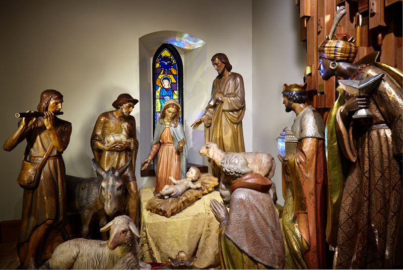
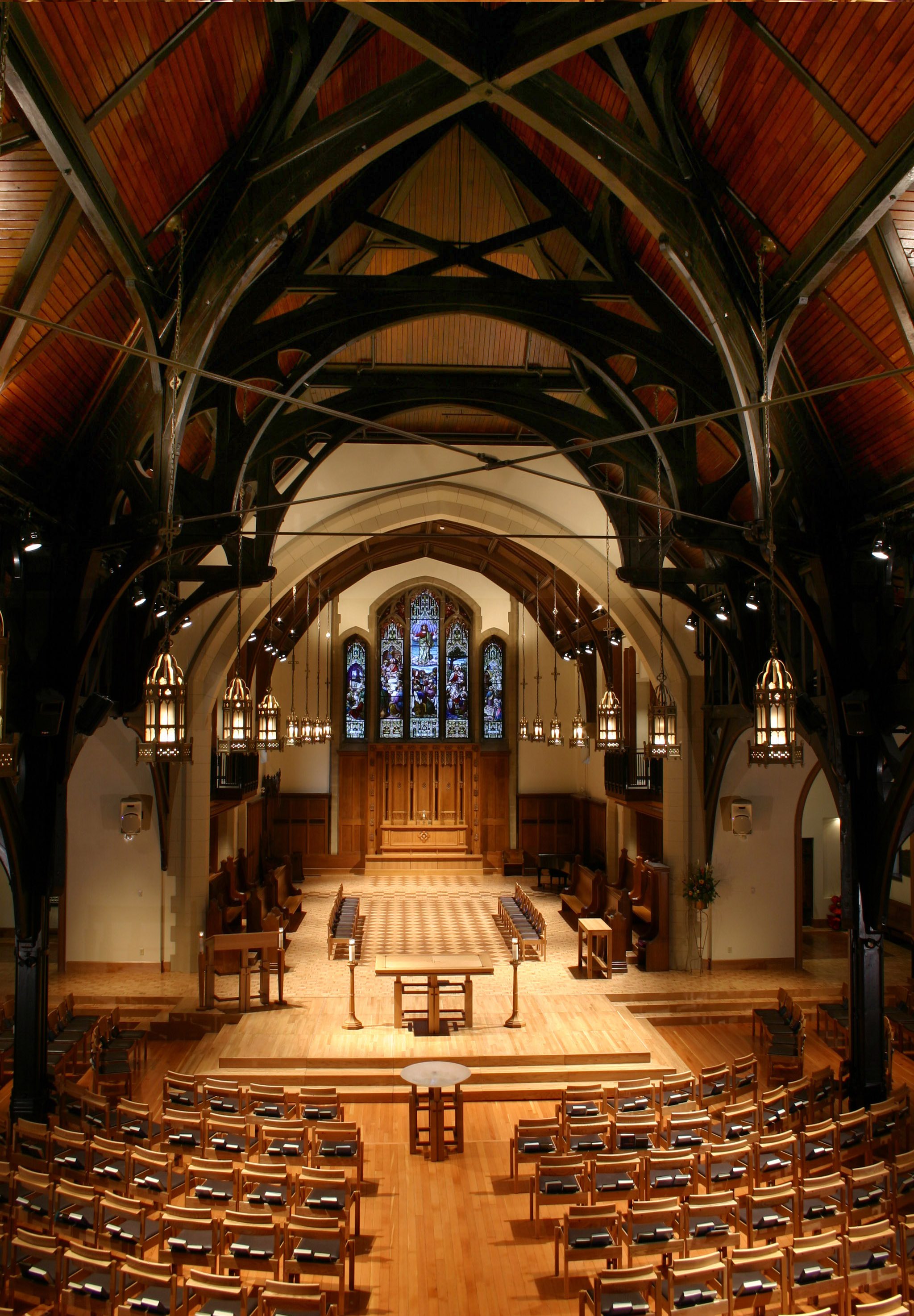
My first really major construction progress documentation project was Christ Church Cathedral's most recent renovation project, back in 2003, co-coordinated by Proscenium Architecture + Interiors and Iredale Group. Some of you will probably remember when the place looked like this:
Christ Church Cathedral Vancouver interior before renovation
Yep: carpet, white donnaconna board on the ceiling, and old-style pew layout. Can't say I miss it! During renovations, that view looked like this:
Christ Church Cathedral ceiling renovation
And then, this:
Christ Church Cathedral front
...which got published full-page in Canadian Interiors magazine, among other places, and isn't too far off from the current view from the choir gallery.
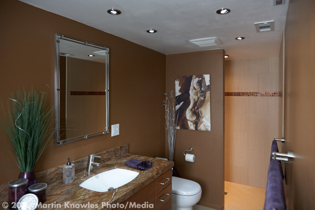
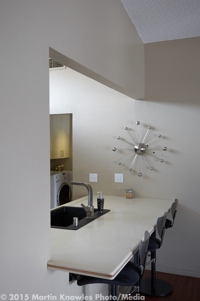
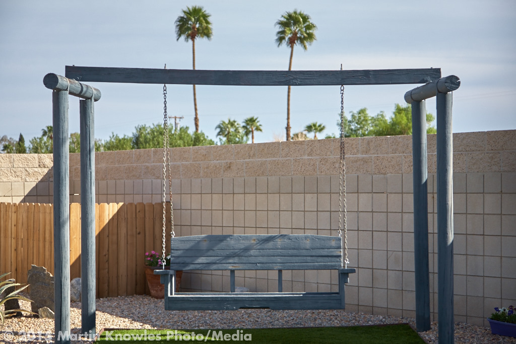
However, for projects where a photographer’s work begins after the place is built, getting to revisit a building over time for commercial photography purposes is a rare and treasured experience.
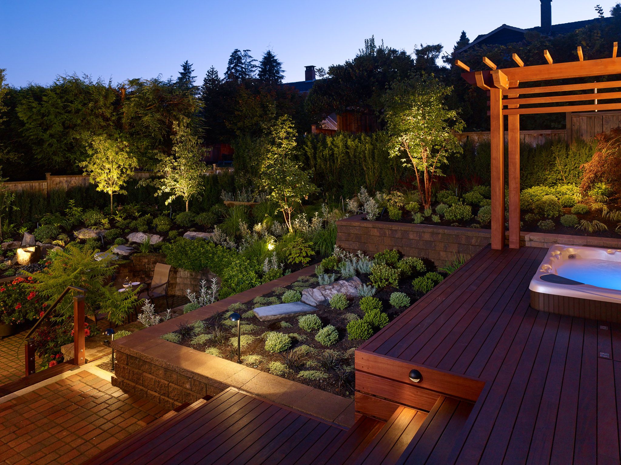
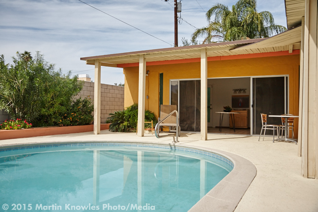
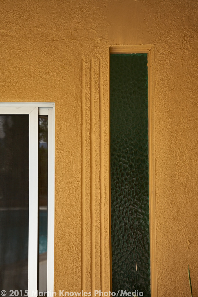
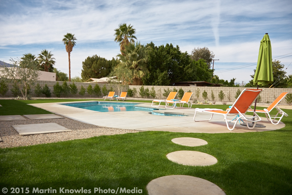
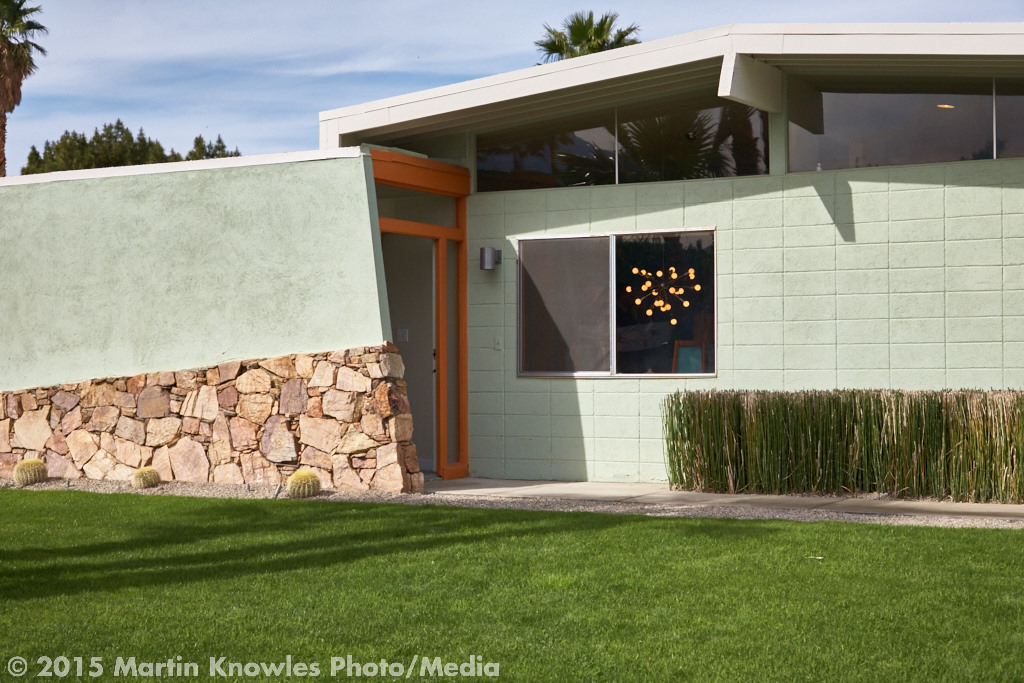
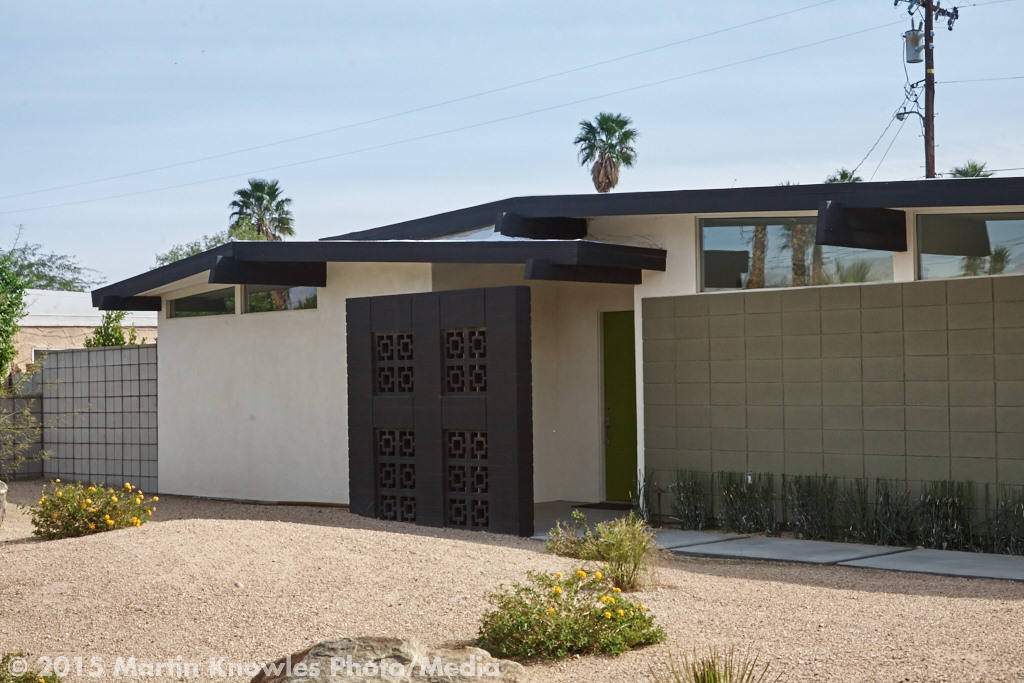
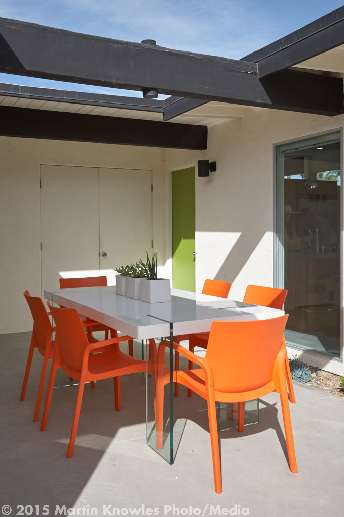
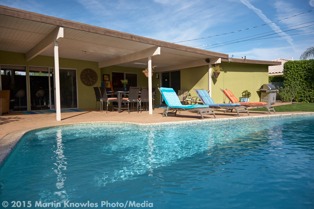
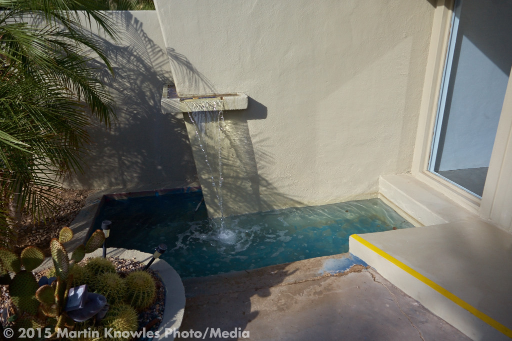
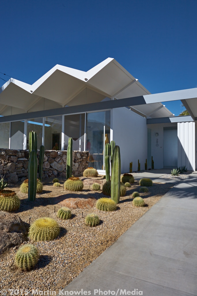
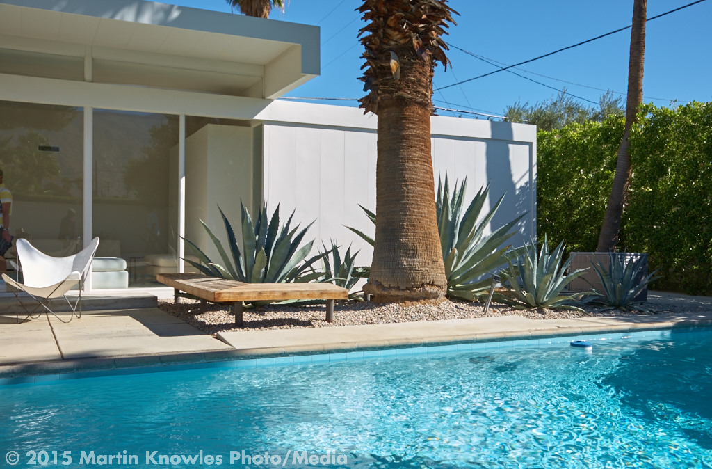
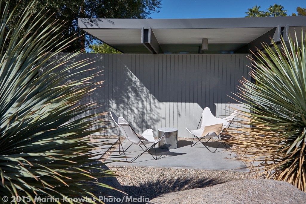
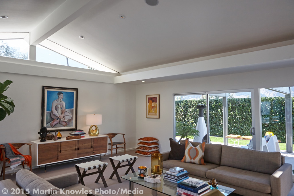
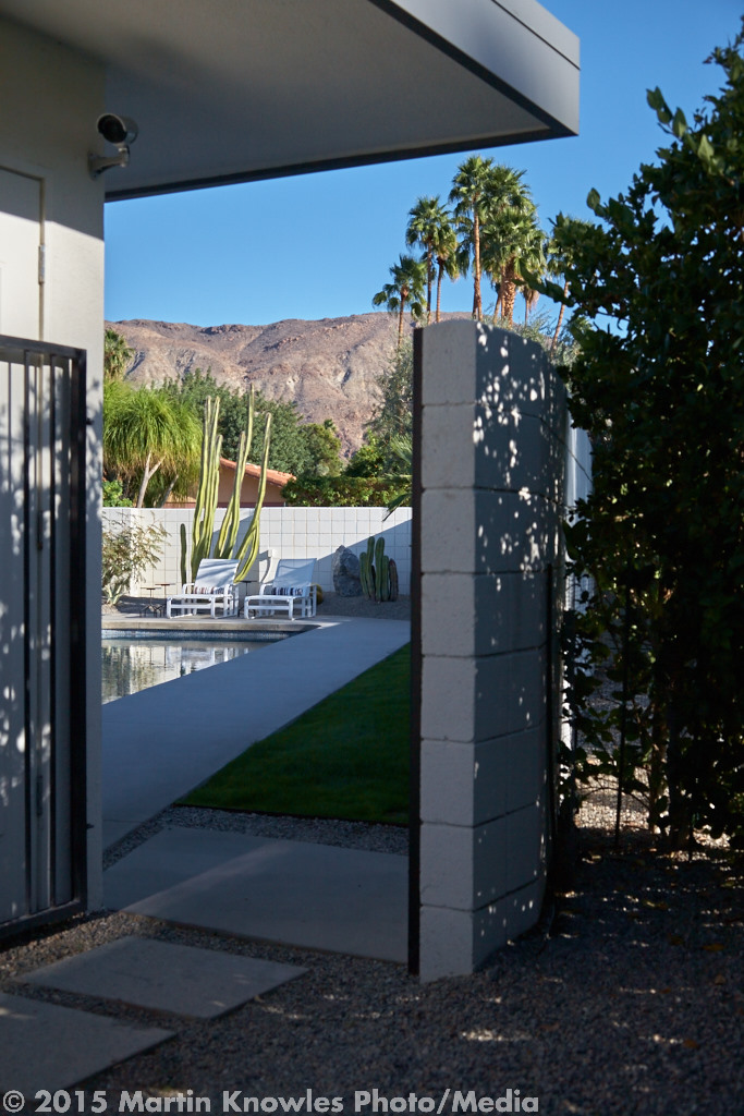
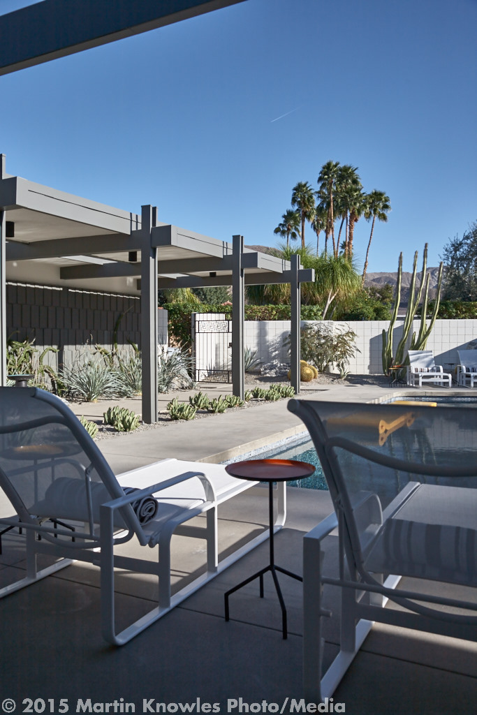
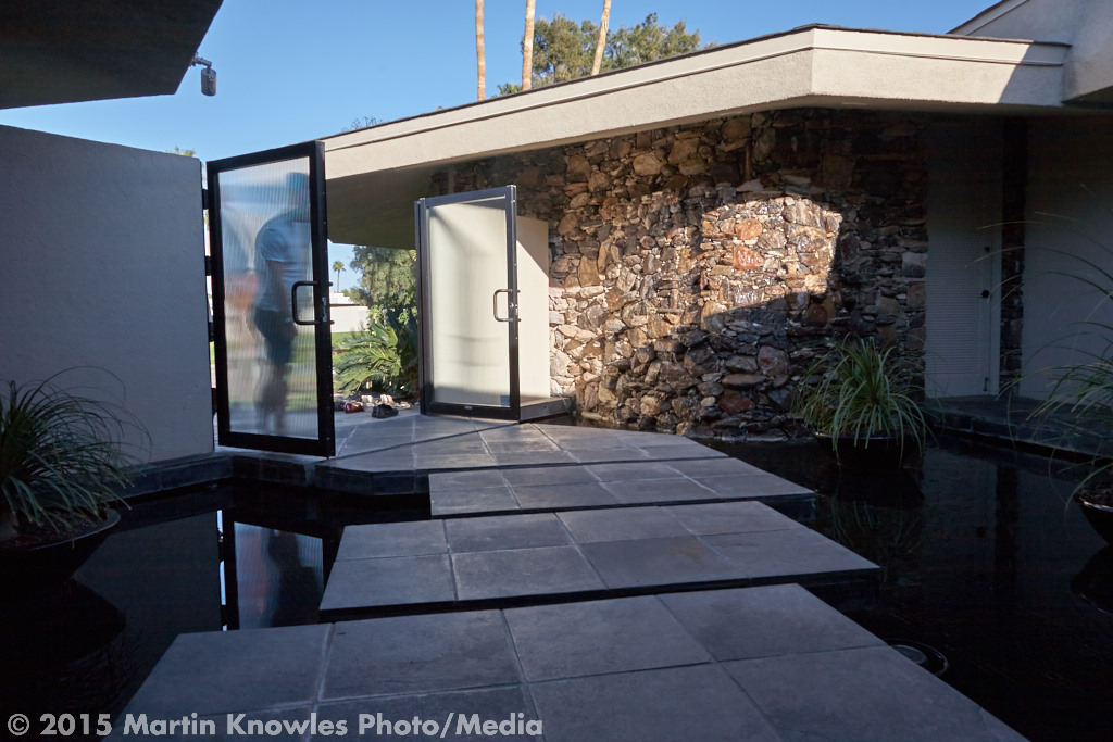
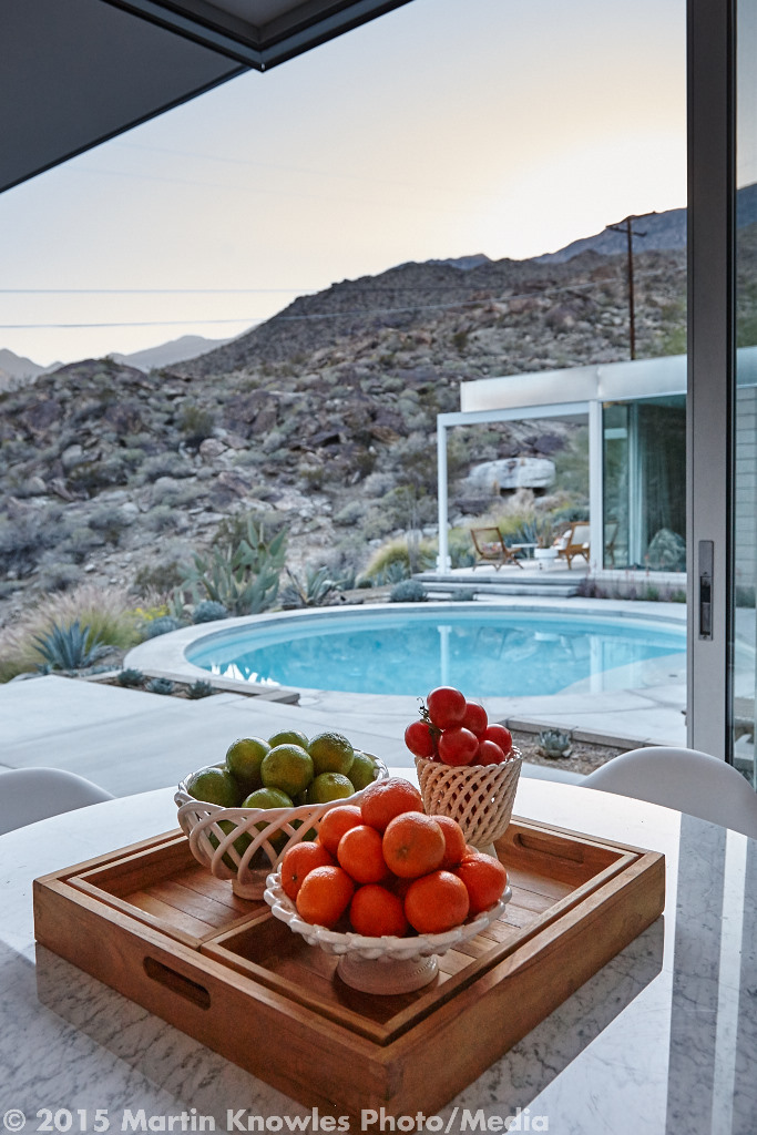
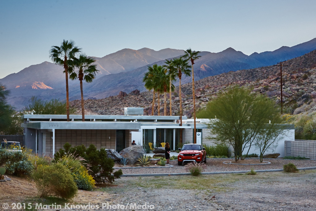
I’ve had a couple of opportunities to do this recently. The first was another Iredale project: the Palmer-Rubin House in Anmore. I photographed this stunningly modern home in the hills above Burrard Inlet a number of years back when it was first built, and one of the notes the architect, James Emery, and I made at the time was that we'd have to come back in a good while when the landscaping had grown in. It's architecturally splendid, but as one expects, it's a little bare:
Modern Anmore Residence
So, fast forward five years, and I had an opportunity to take advantage of late spring/early summer weather and foliage to come back up and reshoot the "all grown in" exterior:
Modern Anmore Architectural Residence
The house has aged well, and now we see how it "pops out" from its landscape.
The next was thanks to one of my real estate clients, 
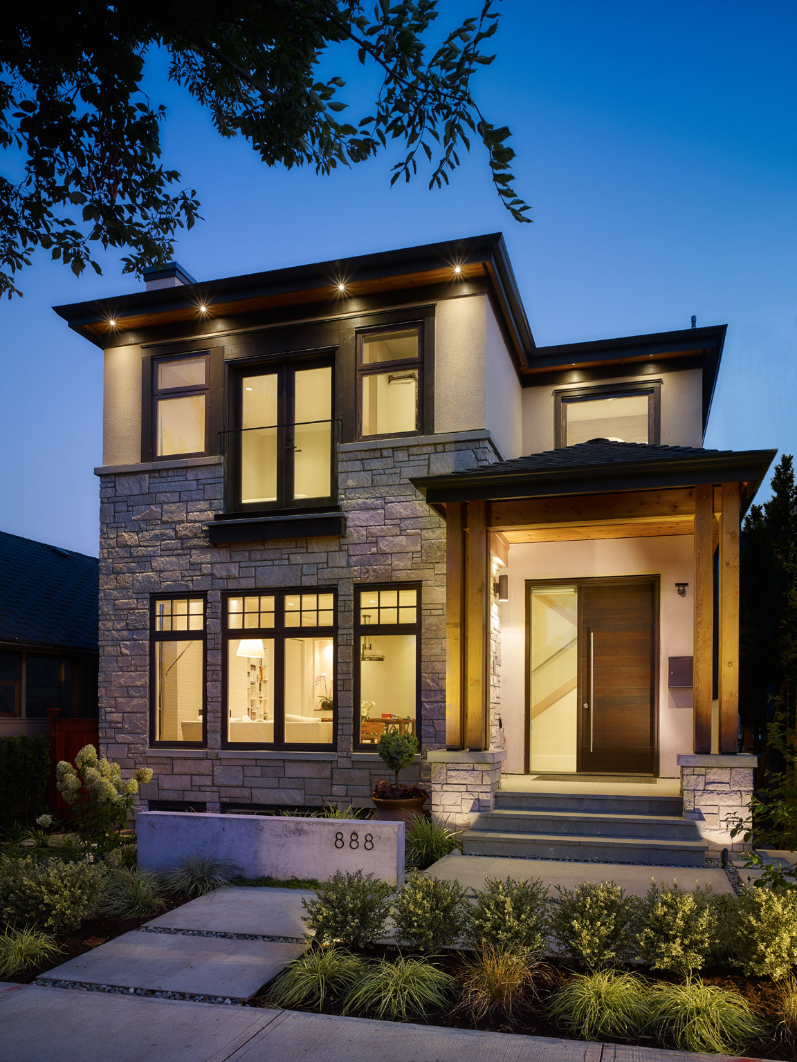
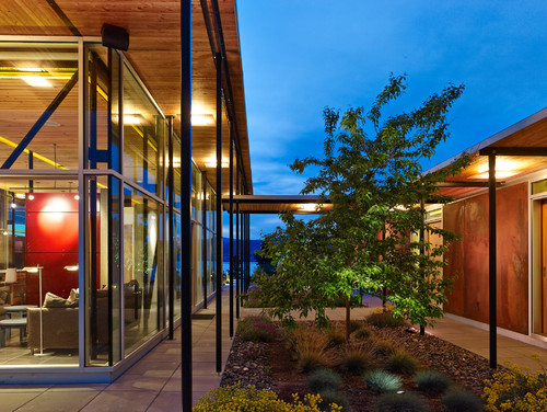
Robert Crowe. On a fine Sunday afternoon, he called me up with a listing at Origin at UniverCity that, of course, had to be shot on an evening that would highlight the view. This building seems to have a theme of "tight weather windows" for me. The first time I photographed this building was in December 2012. Porte Development had me photograph it at the last possible minute for the GVHBA Ovation Awards that year. The show suite was all done, but we had to wait out a run of nasty December weather, and had a tiny weather window where we might just have half a chance at getting a few shots. We ended up indeed getting a weather window...of about 15 minutes. Which was just enough to run outside from shooting the show suite, snag a boom lift and an operator from the construction crew, suit up with a harness and get several elevated 'hero shots' of the full development. For those of us with absolutely no fear of heights, it's always a good day when you get to ride a boom lift. This image is the "raw" pre-crop-and-edit version, where you can still see the lift machinery in the bottom corner.
After the project won a couple of Ovation Awards that year, writer Lynn Harrison (who coordinated the written parts of their entry) and I had a quick talk at the awards gala, and we thought that it would be a great run for a Georgie Award and recommended to the good folks at Porte that we should reshoot it when done and enter it in a few categories it wouldn't have qualified for at the time of the Ovation Awards.Which gave me another opportunity to rephotograph the place with the landscaping grown in and fences removed. The problem? We wanted to highlight the north-east face of the building, and the only time you get light on that side of the building is first thing in the morning, and from my experience as an SFU graduate, I happen to know that the SFU Burnaby Mountain campus is often up in the clouds and fog at the hours you would be getting the best light. So, another weather crap shoot.
Having soft light and big clouds actually flattered the building well. We got images like this:
The project ended up being a finalist in three Georgie Award categories that year, just as we hoped!
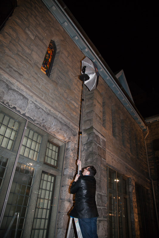
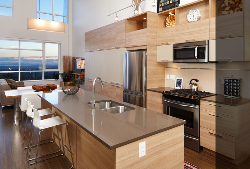
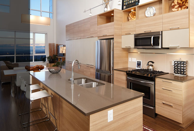
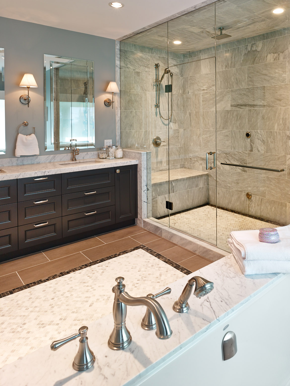
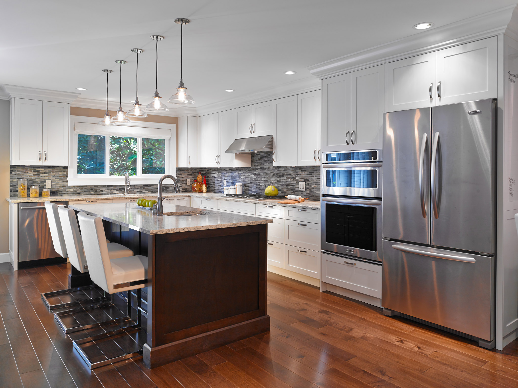
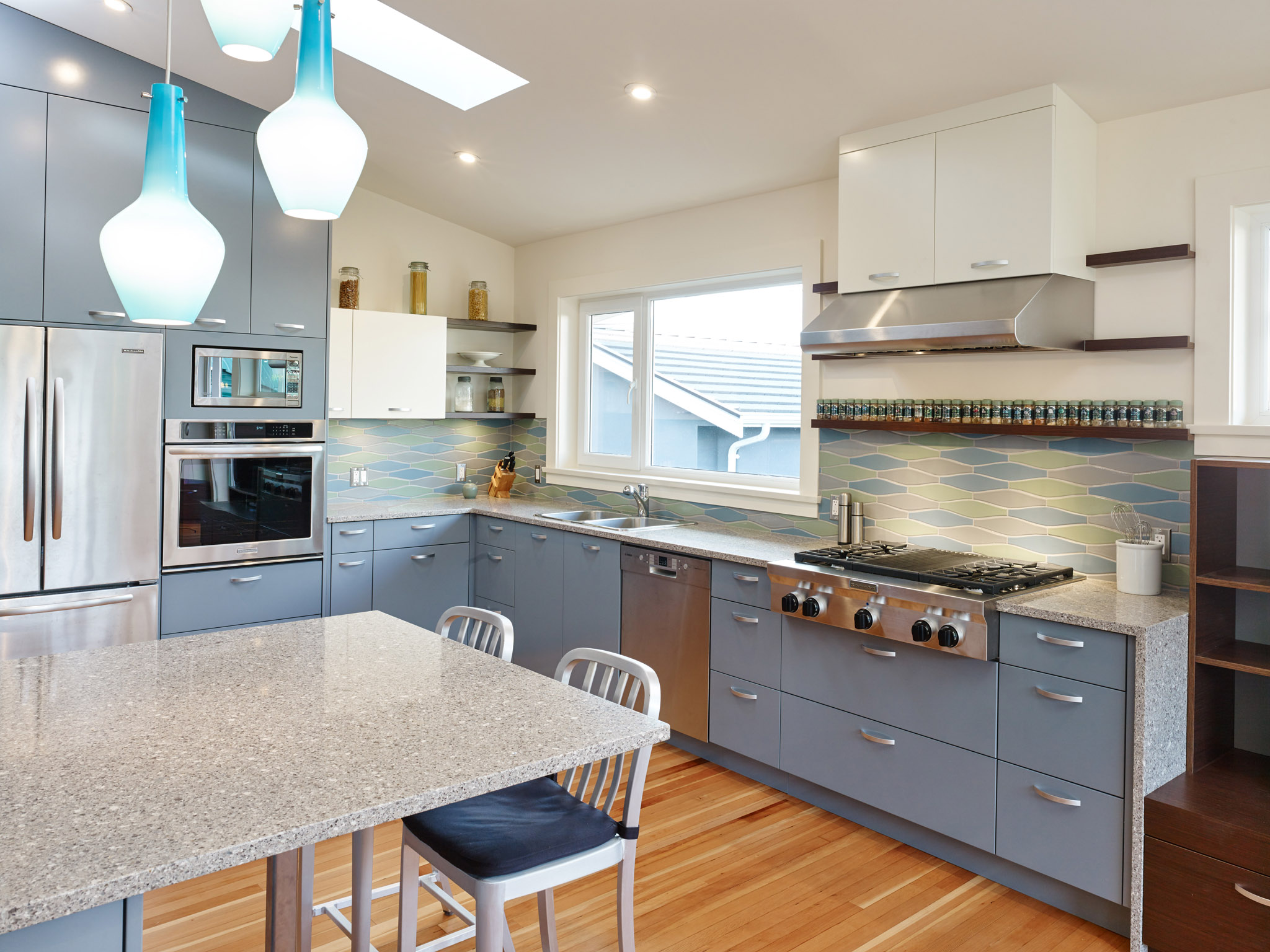
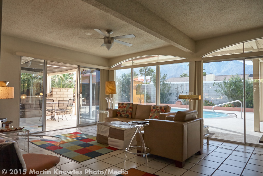
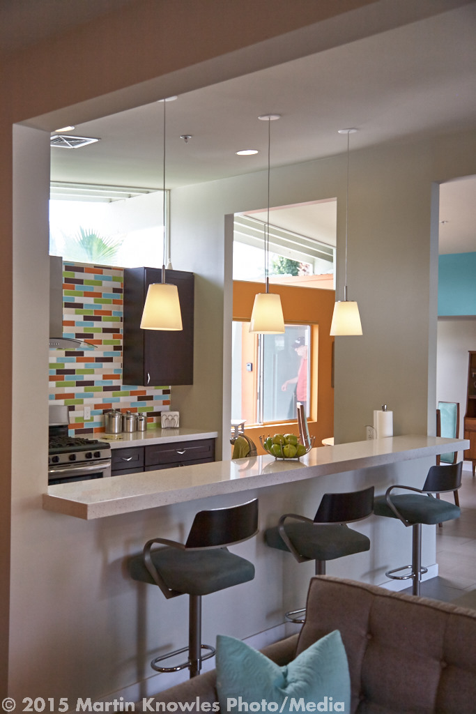
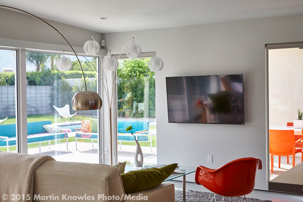
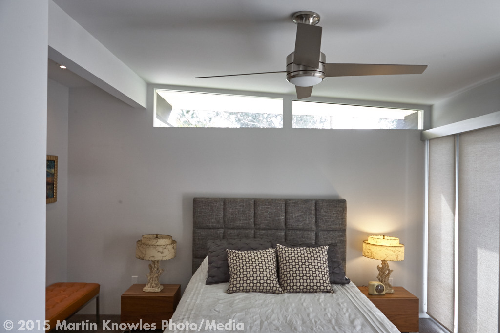
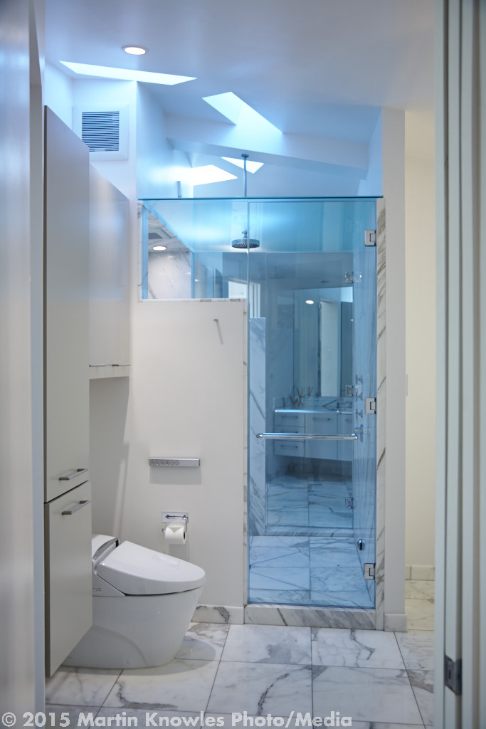
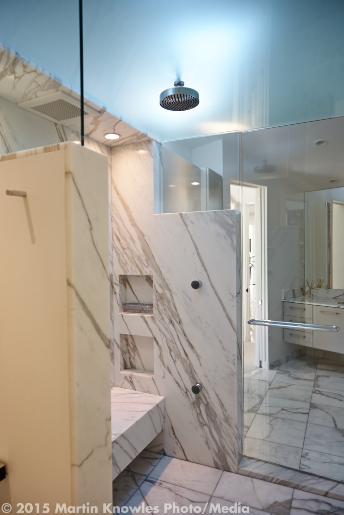
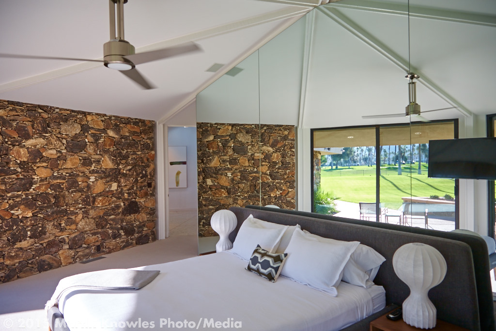
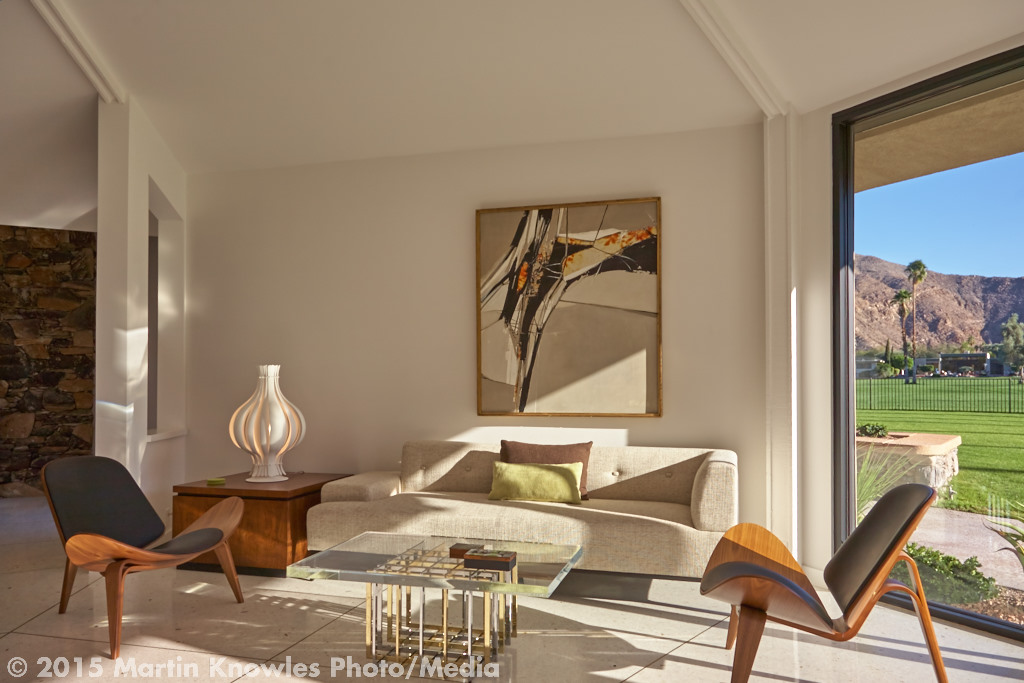
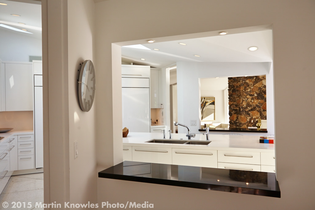
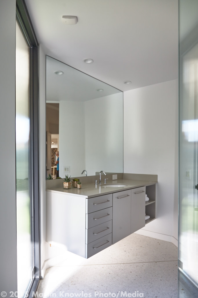
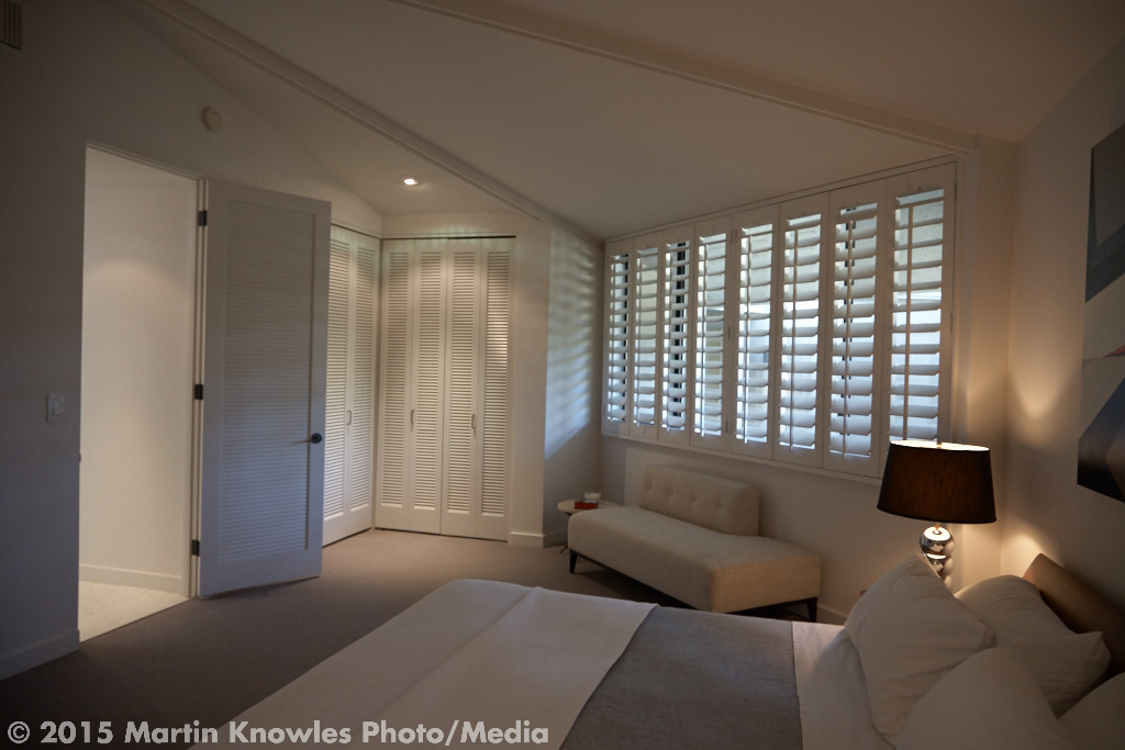
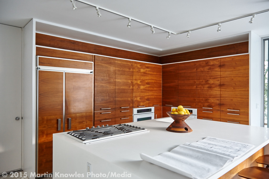
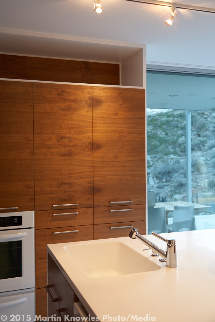
So, fast forward to a few days ago. Robert called me with a unit up at Origin to shoot, and after he gave me the unit number, it turns out that it was the unit next to the show suite. I'd probably been in that unit under construction, and since it faces south, I knew its rough layout and that it would have to highlight its window view. Sunsets, magic hour, the whole bit. This time, I could completely ignore the exterior and common areas, since I'd already photographed them for Porte's Georgie awards submission and could just re-license them out of my stock library. I checked the weather forecast, and the only day we could possibly shoot in the next week was...that day. So, it was time to carpe diem, grab the gear, and blast up the hill to take advantage of yet another weather window at Origin!
Porte Origin Burnaby modern loft
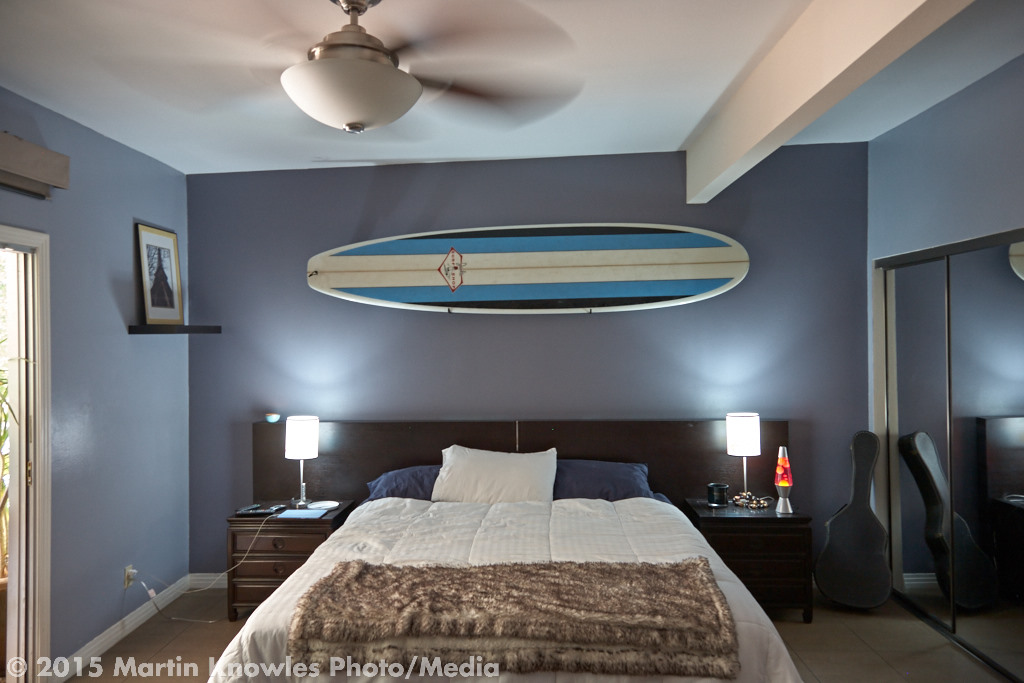
One of the great things about rephotographing a building is that you have a very good idea of what gear and what shots you need, so you can "travel light" and move very quickly. This was indeed the case, although there was one critical set of lights out in the kitchen that I had to fill in with flash instead. One of Robert's associates got to work as my 'voice activated boom' for the evening and got her upper body workout for the day holding the flash on a stand as far up as possible!


Capture One 8: a few weeks in

I've been using Capture One as the core of my architectural photography workflow for about a year and a half now, and having started out with 7.0, like many of us I have my fair share of scars and scrapes from climbing up the learning curve (and in 7, oh what a learning curve it was: early C1 7 builds were so buggy that as a new user, figuring out whether something didn't work because you didn't know how to use the tool or the tool was just plain broken put me in the habit of keeping forum.phaseone.com open in a browser on my second monitor most of the time--and don't get me started about seeing the crash dialog more than my photos!). Despite the pain, suffering, and frequent restarts, the results were definitely worth it. Later 7 builds got better, and I settled into a solid though sometimes frustrating workflow assisted by a small pile of shim scripts. One of the side effects of having a computing science degree is the tendency to say "if this isn't working exactly the way I want it to, pull out your editor and hack scripts until it does", and I've done a lot of this over the last while. It's a general rule (right up there with 'expose for the highlights') that Thou Shall Not Deploy A New Capture One Release Into A Critical Workflow, particularly when the release ends in zero. As luck would have it, the C1 8 announcement hit my mailbox a week or so into the start of September, which was the start of the most horrifically busy shooting season of the year, thanks to the Georgie Awards and a number of my clients having late-finishing projects. So I called the folks at Capture Integration to ensure that I could install 8 alongside 7, giving me a good safety net in case things went off the rails. With a mix of anticipation and trepidation, I hit the download link and installed 8, hoping for the best and fearing the worst.

Within a couple of hours, I'd spun one of my projects through it, giving it a good workout and exercising a number of new features. To my surprise and delight, the only crashes I experienced were due to it not having a proper license code, so a few hours later, I was on the phone with CI once again to snag one and call it an upgrade. Having been working with C1 8 for a few weeks now, there's a lot to love, and a few things that of course need improvement:

The Good:

  • Speed and stability. I edit on a mid2011 27" iMac with 24gigs of RAM and a 250gig SSD, and capture tethered on a mid2011 13" MacBook Air with 4gigs of RAM. Both run Mavericks. That's two ends of the spectrum, and 8 is both a lot faster and more importantly, more stable on both machines, Over the past few weeks, I've had maybe 10 crashes tops in near-daily use, and several of those were due to a glitchy Thunderbolt to FireWire adapter on the Air. Rendering and a lot of interface actions feel snappier, and exporting JPGs and TIFs, especially on the iMac, really scoot along. In fact, I've ended up hitting the Process button twice a few times before realizing that a single file export happened faster than C1 could throw up a progress indicator. Awesome. (Now I have to script a 'ding' on process completion, as Lightroom does, to keep me from doing this)
  • Better support for sessions on network drives. When I'm done delivering a project, I throw the whole session onto my QNAP NAS. In C1 7, for reasons known only to the boys in Denmark, sessions on network drives were horribly unstable. So much so that I got into the habit of downloading sessions back onto my local hard drive and then RSyncing them back up to the NAS, lest C1 hose completely. This is now almost unnecessary. There is one case where it seems to be necessary still, and that's when migrating from a 7 session and regenerating previews. More on that later. But once you have an 8 session with previews built, you have the luxury of being able to edit on a session without having to pull it onto a local drive first.
  • New highlight/shadow recovery processing. When shooting interiors, I often end up using highlight recovery to pull skies and window areas on interiors into a range that looks reasonable but doesn't require me to do exposure fusion and sky replacement. If I'm shooting on the Phase, there's so much dynamic range available that what would often require multiple shots and exposure fusion to pull off can be done with a flick of a slider. 7's algorithms for highlight and shadow recovery were...touchy, to say the least. It was often a matter of a few points on a slider between 'great' and 'weirdly fake'. 8 is much better in this regard in most places, though there are a few places where the old algorithm gave better results. I'd hope that there will be a 'classic' vs 'new' setting on those sliders in some future version, just like the ability to select your Clarity algorithm.
  • Adjustment layer improvements. This is HUGE. The ability to do highlight/shadow recovery on an adjustment layer, at long last, convinced me to pull my wallet out and finger my credit card. The ability to change white balance on an adjustment layer was worth the price of the upgrade, and the risk of causing myself pain by, uh, throwing a Phase One .0 release into a critical workflow. These two features have saved me enough time and frustration to pay for the upgrade right there. Local white balance and local recovery are the two things that would often have me creating multiple variants, processing to multiple Photoshop layers, and using layer masks to bung the whole thing back together. That was of course slow but often necessary. The new Repair Layers I've found to be of limited usefulness, but I also haven't explored them much either yet. If I need to do that level of work on an image, chances are I'm going to be taking a round trip into Photoshop anyway.
  • Templates. I've always liked the ability of Workspaces to put your palettes and tool tabs where you want them, and it's nice to finally have the same ability for stuff like tether settings, folder layouts, and naming rules. (But why can't I use the image number as an element in a Processing naming rule? I'd love to be able to change IMG_2755 or TQ-west13-2755 into MKPhoto_2755 on delivery.)

The So-So:

  • Tethering improvements. I shoot almost entirely in a tethered workflow on location, so this is pretty critical. My P45 has always been pretty stable tethered, but C1 has had occasional weird issues tethering my Canon 5D Mark II. C1 8 seems to be a lot better in this regard, but the longstanding bugs in magnifying in live view seem to still be outstanding. If you don't need live view, C1 8 is a lot better than 7, but I still find myself using EOS Utility for tethering and dumping the files into the Capture folder, letting C1 merrily generate previews in the background. EOS Utility's live view support is far and away better than C1, still, at least on my 5D2.
  • Masking. The masking tools are less laggy than the ones in 7, but I keep running into weirdness with Auto Mask working inconsistently, and the flyout that lets you choose draw/erase mask, well, not flying out. If you're using the speed keys to move between these tools, this UI weirdness is not such a big deal. However, about every third 7 maintenance release, the eraser on Wacom Intuos-series tablets no longer toggles the erase tool as it should. Guess what? 8's is broken again. (Yes, I know you can set up a macro in the Wacom control panel to work around this, but then that breaks when C1 fixes it. You just can't win.)
  • LCC generation is still single threaded. I shoot with a tech cam, which means creating an LCC for just about every shot. Unless I absolutely need one on location, I end up generating all my LCCs en masse when I load the session onto my editing machine. It's mildly annoying that I have to watch one CPU get pegged while I'm forced to go get tea or surf the net while I wait for a couple dozen LCCs to build before I can really get down to work on a session. Unlike C1 7, you can generate LCCs en masse without corrupting your session, which used to happen so frequently in 7 that I'd do the LCC generation on a backup, throwaway copy of the session.

The Ugly:

  • 7 to 8 session migration. I've tried opening a lot of 7 sessions in 8, and I can count the number of times it's actually worked on one hand. That's not too surprising given the number of times I've had a session file break between 7 maintenance releases. I no longer bother, since all the critical metadata and editing decisions are outside the session anyway. I'll just blow away the .cosessiondb and regenerate it. Which forces a regeneration of all the previews, but at least I have a stable, and fast, session at the end of it all.
  • Regenerating previews en masse on a network drive. I've had mixed results with this. Sometimes it works great. Sometimes regenerating previews will hang in the middle of the job and never complete, in which case copying the session onto a local drive before rebuilding will do the trick. I haven't benchmarked, but I suspect that copying, rebuilding previews, and RSyncing back is potentially faster. This seems to be better on AFP-mounted shares, which means there might be some weird network compatibility thing going on.
  • Running externally edited TIF files through a C1 process recipe. Because C1 process recipes are so awesome for setting metadata, resizing, and ensuring consistent colour profiles on the fly, I usually prefer to edit what I can in C1, then work files in Photoshop, select the edited Photoshop TIFs in C1, rate them accordingly, and process them using C1. There is a bug, acknowledged by Phase One, that causes the previews to get out of sync and Regenerate Previews to not work correctly, causing exports of edited TIFs to fail with a Code 19 or other oddities. If this bites you (and it bites me all the time), close C1, fire up a Terminal window in your Capture folder or wherever you're processing from, and run: rm CaptureOne/Cache/Thumbnails/*tif* rm CaptureOne/Cache/Proxies/*tif* then reopen C1, and once it regenerates the previews for the files you want to export, process and you'll be good to go. This video shows how it breaks (and it still breaks in 8.0.1)

All in all, apart from a few niggling complaints, I'm the happiest I've ever been with a C1 release, and I'm very glad to have take the risk of upgrading at the busiest time of the year.

End of another Georgie season

There's a wonderful prayer in the New Zealand prayer book that we say at Compline at Christ Church Cathedral every week. It ends like this: "It is night after a long day. What has been done has been done; what has not been done has not been done; let it be." To paraphrase it: "It's the deadline after a long and busy Georgie season. What has been entered has been entered; what has not been entered has not been entered; let it be." That is, until the Ovation Awards (I'm told the call for entries will be opening in another couple of weeks). Or next year, if your completion schedule was what was in your way.

It's been a very good and extremely busy season--we've photographed some amazing projects, seen some other amazing projects that weren't quite ready in time for the deadline, and we're hoping the best for all of you in your respective categories! For those of you who waited until the last minute, and for our fellow writers, photographers, and all others running similarly wacky schedules: you can now relax and catch up on the sleep you haven't been getting. It's going to feel weird tonight not being up until the wee hours putting finishing touches on photos, and I'm hoping to be dreaming about something other than Capture One adjustment layers, and not waking up in a cold sweat chanting "dusk images are acceptable as long as all relevant building detail is visible."

And may the best projects win!

Dead Gear Society: PAP Edition

I used to participate in a bicycling forum that had an area where people would report when a piece of equipment failed, how, and under what conditions. This was tremendously useful for figuring out what worked, what didn't, and what you might expect if something busted. Georgie Awards season seems to be particularly hard on gear (and photographers, for that matter): you're shooting constantly, you're moving quickly, and everyone has the same deadline and seems to save things to the last minute, so things get "ridden hard and put away wet". Every year, something often gets busted over the course of the Georgie rush--even if it's something minor like a flash trigger (that's happened a couple of times), or cabling. We all love it when Georgie projects win, but it's also instructive to see when gear...loses it big. So I'm making a couple of contributions to the fine tradition of reporting gear failures. Onward. I shoot a fair number of exteriors using pole aerial photography (PAP). PAP is a great way of getting a second or third-storey elevated position on a building, and it's particularly nice for real estate work and for highlighting things on roofs. The project I photographed earlier today is a perfect candidate for this: it's a three-storey townhouse with...solar panels on the roof! So, out came the pole, and photos like this got made:

Tien Sher Jade Pole Aerial

Standard developer photo fare in this market, in other words. This was on a windy early afternoon, with inconsistent light--as you can see, it went from bright sun to dark cloud, and so I was having to move quickly. Moving a pole aerial setup without an assistant is a bit of a chore: you retract the pole, then with both hands, slide the pole out so you can carry it by the weight of the camera (and if you shoot tethered, as I almost always do when shooting PAP, grab your laptop with your now-free hand). That's the usual and "safe" way to do things--but when you might only get a few seconds of decent light, you can often tweak your framing by scooting the pole along the ground, particularly if you're on wet grass. My luck ran out with this approach: while moving the pole into position, elevated at about 12 feet, a gust of wind pushed the pole right when I didn't have it solidly stabilized. Even a partially extended pole with a Canon 5D2 and a 17-40L on it gets unwieldy quickly in those conditions...and down the whole thing went. Somewhere in the fateful second or so between "we're there, let's shoot", "aim for the grassy boulevard!", and "f*** nooooo!" something interesting happened: the top thread of the pole sheared off, sending the pole one way and the camera, pole adapter, and resting plate, rolling off into the street. Ouch.

sheared off pin

The good news: the camera survived, amazingly. (I likely have Really Right Stuff's custom-fitted Arca-Swiss L bracket to thank for that; a single point screw tripod plate would have probably ripped the tripod screw clean out of the bottom of the camera) So did Pole Pixie's Pro screw adapter, the Desmond Arca-Swiss-compatible clamp, and the foam resting plate--though it's even more banged up than it was before and I should probably replace it. And apart from being cosmetically torn up, the RadioPopper JrX trigger I had in the hot shoe also seems to have survived.

The bad news: the nearly new 17-40L lens (bought to replace a previous copy of that lens which, uh, I dropped a couple of times and after a couple of trips back to CPS, wouldn't hold its focus particularly well) and the expensive circular polarizer took all the force. The polarizer's obviously toast. The lens I'm not so sure about--I'm calling CPS first thing on Monday to see about repair pricing. My gut feeling is that it's probably going to end up as an expensive paperweight, but since the glass seems to be fine, I might be able to get away with having the front ring replaced and the whole thing recalibrated.

photo

Now what? Apart from figuring out what to do about that lens (it's a backup lens, so I kept merrily on shooting on that project with other lenses), I now need to put together a new PAP rig. The resting plate isn't intended to take the full weight of a falling camera, but it's certainly done well breaking falls--so it, or a variant on it, is a must. The Pole Pixie adapter survived with nary a scratch, so it's good to go, and so is the Arca clamp. Pole Pixie has a 5-section pole that looks better than the pole I was using (which worked well for about 5 years)--and it's seemingly a rebadge of a pole that's actually designed by a company in Ontario for display use, so to avoid customs issues I'm trying to see if I can source the original. A few months ago, I was considering that a safety line rigged from the camera to a point below the pole top would probably be a good idea, and it turns out that I was right: had I rigged something, the lens might have survived. What looked like a possible weak point...was.

So now I have an industrial design problem to solve: since it's a near truism of pole aerial photography that Someday, Your Gear Will Fall, I'm thinking that the Real Solution to this is to put together a lightweight roll cage--ideally, out of bent metal rod, but prototyping it from metal drywall angle would probably do the trick and would be a lot better than nothing. The cage would be set up to not obstruct the field of view on the 17TS-E (yes, I've been known to fly that $$$$ piece of glass on the pole...call me crazy, but the results are worth it) when shifted, and would attach to the pole below the threads--possibly with a plastic or metal collar.

Exteriors first, interiors later?

It's almost September, and that means: 30 days until the Georgie Awards deadline. Time to get off the beach and get to work on your marketing efforts, eh? Only a few more days like this

There's an old joke that floats around Vancouver: "What do you call five days of sun followed by two days of rain?" "A weekend". Or, if it's this summer: "What do you call three weeks of sun followed by three days of rain?" "Labour Day Weekend". We're supposed to be getting some more dry, sunny weather soon after the long weekend (hooray), but that brings up the question: what if my exterior is done but we're waiting for the light fixture that's on the slow boat from Italy?

That's easy: you let us know that, and we shoot the exterior first, while there's good weather around, and shoot the interior later. We normally charge a bit extra to cover the trip out, but the results are always worth it. You'll get the best of both worlds: an interior that's done and an exterior that's showing in its best light.

It gets better, though: for our awards packages, we can often throw the extra visit in for free, because everyone's on the same deadline and it makes the scheduling easier. Several of our clients are already taking advantage of this, so if you're in the situation of having a perfectly gorgeous exterior and a few bits and pieces to work on on your interior, let us know and we can make that scheduling happen.

It's a dust speck...no, it's...?

Now and then surprising things happen in the editing process. After a long day of editing several recent projects, I noticed what my tired eyes thought was a chunk of odd dust in this image made for one of my architectural clients: Surrey Architectural

You can probably see it, right above the trapezoidal projection above the wash bays. Normally, Capture One's LCC function knocks out obvious spots like that, so I was a little surprised to see it there to begin with. But before grabbing the 'Remove Spot' tool and obliterating it, I zoomed in and saw:

Plane

That's not a spot...it's a plane, rendered pretty sharply, at that. I'm sure there are a few aviation junkies reading this who can tell me what kind of plane that is and whose livery it is. Now that's just "plane" cool!

Georgie on my mind

It's official: two months left to the Georgie Awards deadline on Sept 30. Two months, folks. While that sounds like a long time out (it's in late September, and, well, it's BBQ and fireworks on the beach season still!), that's coming sooner than you think. I've been photographing an increasing number of projects for my clients' Georgie Awards submissions, and a tip of the hat (or the lens hood, as the case may be...) goes to those of you who are not waiting until the last minute. For this, we salute you. With better images, a bit more sage advice on location and otherwise, and lower rates, of course. As a number of you know, I'm a big jazz and blues fan, and I recently made a last-chance-before-Georgie-Season trip down to Portland for the Portland Waterfront Blues Festival. I happened to be listening to a bunch of tracks I bought from the festival artists, and a great arrangement of Georgia On My Mind came on as I hit the 'process 68 images, two versions' button on Capture One. While waiting for the images to process, I put this little parody together, in honour of all of you who are also facing down the Georgie deadline:

Georgie, Georgie The whole summer through Just a hard deadline Keeps Georgie on my mind

I’d love a Georgie, Georgie A gold statue Comes as sweet and clear As moonlight through the pines

Other awards reach out to me Ovations start will soon to be Still in my fitful dreams I see The work leads back to you

I said, Georgie, oh Georgie No peace I find A September deadline Keeps Georgie on my mind

Houzz That!?

Is there anyone out there in the design world who's not yet familiar with Houzz? If you're one of the few who wasn't until I mentioned it, go check it out: it's Pinterest for residential interior design, with discussion groups, a lot of really good (and sometimes not-so-good) photography of interesting residential goodness. In addition to lots of project photos, Houzz publishes a lot of useful editorials. A few weeks ago, this one crossed our email box, and it hits the nail completely on the head: How to Hire and Architectural Photographer. This readable little primer talks about a number of things we often talk to our prospective clients about: including the differences between photographing for architecture and real estate, what to expect when we're on site, the importance of hiring someone who specializes in the built environment (yep, we do both real estate and architecture and love both--but let us know what you need), and other important things. Worth a read.

houzzwindow

As you might guess, we have a profile on Houzz as well, with a goodly number of projects. Check out our Houzz profile, and if you're one of our clients on Houzz with a project we've photographed, let us know so we can link to you.

Getting More Value From Your Images with Cropping

We're shooting most of our higher-end projects using medium format digital these days. While it takes just a little bit longer, it has all sorts of advantages over digital SLRs, including better, more accurate perspective and colour (which our architect and interior design clients particularly appreciate), and images that have ultimate detail and resolution. While very few of you are printing our images at the poster or billboard sizes where the extra resolution really shines, having the extra resolution available gives you a lot of flexibility in how you crop your architectural photographs, and that translates into making our images much more versatile and valuable for you.

Cropping? What's that?

Let's back up for a moment. Crop is a fancy way of saying 'cut down'--in this case, an image from one size to a (usually) smaller size. There are a bunch of reasons to do this, including removing distracting elements, 'zooming in' on a particular feature, or making a photo fit a different format than how it was originally shot. In Real Life™, you've done this every time you've put a picture into a frame that's a lot smaller. Almost every image editing application (even the built-in stuff on your smartphone!) has a tool that lets you do this to digital images. For instance, let's take an image from a recent shoot for TQ Construction, and imagine a countertop supplier wanted to use the image on the cover of their next brochure. Once they licensed the image, they'd open it up in an image editing tool like Photoshop:

The original image

...and crop it. When you crop, Photoshop helpfully gives you a rectangle that shows the area we want, and greys out what we don't. We can move the rectangle around until we've selected what we want, and then...boom! We're cropped.

The cropping rectangle shows the section we're taking

cropselectdone   Here we have the final version: we've kept the part of the image we wanted, and chucked the parts of the image we didn't. Now we're really showing the countertop, which is what the countertop supplier would likely want to show off.

Image size: underpromising and overdelivering

When you're going to use an image, your printer or graphic artist, or the folks who run the design award you're submitting for, will tell you that they want an image of a particular size. They usually tell you something like a "1024x768 image", or "enough for an 8x10 at 300DPI", "6 megapixels", or "to fill an HD monitor at 1080p".  These are four different ways of specifying an image size. Let's look at them for a moment:

  • 1024x768 is a pixel dimension. They want an image that's 1024 pixels wide by 768 pixels tall (or vice versa); this is a common size for website, real estate MLS, and PowerPoint presentation usage.
  • 8" x 10" at 300DPI is a size and resolution. That's common in images destined for print (whether it's a magazine or your local photo print shop); it means that they want an image that can print at 8"x10" at 300 dots (i.e. pixels) per inch. Whip out your calculator, and...they're wanting an image that's 2400 pixels by 3000 pixels. (Those of you with background in print graphic arts will know that I should have said 'PPI' for this, but 'DPI' is more commonly used. Yeah, it pains me too.)
  • 6 megapixels means they want an image where the horizontal * vertical pixel counts multiplied together is 6 million. Camera sensor resolutions are in megapixels, and if you get a request for something in megapixels, it usually means that they don't care about the actual dimensions as long as the resolution of the image works out to 6MP. This means that a 2000x3000 image is good, but so is a 4687x1280 image (which would be a wide panorama). When photographers quote an image size, they often specify it in megapixels because it gives us room to compose whatever size is going to work best for your application. In most cases, we deliver 20 mexapixel images (as of this writing) minimum, and often larger. More on that in a bit.
  • fill an HD monitor at 1080p means that they want an image for video/presentation use on an HD display. Like the first one, this one has a specific pixel dimension: 1080p, by international standard, means 1920x1080.

So, numbers and letters aside, if we lay some of this out graphically, we get: Image resolution chart medium format   That little box in the lower left is 1024x768. Next up is an 8x10 print at 300dpi, which is pretty common in magazine and awards work. The green box is a 20 megapixel full-resolution image, and the big blue box is medium format digital, which is what we often deliver. You should now be realizing that, in the space of a single medium format digital image, you have a LOT of possible web images if you crop, and, strictly speaking, the resolution of over 4 8x10 prints at 300DPI.

And now: fun with cropping!

When you crop, you throw pixels away (i.e. you lose image resolution). This might sound like a minor calamity if you (like us) dislike wasting things, but it actually works out to your advantage because the images you receive from us are so much higher resolution than you usually need. We gave you the whole enchilada, but you don't need to eat it all in one sitting! While you can use the full resolution image, or resize it down to whatever size you need, you can also crop down from it and get all sorts of other possible photos that will work for various uses. This means that when you pay for a single full-resolution image, what you're often really getting is a lot of possible images inside the image you paid for if you choose to use them. The smaller the image you need, the more flexibility you have. Let's pop out a couple of 8x10 crops from our example kitchen:

Cabinet and backsplash detail

Counter and cabinet detail

We've reduced them for Web use, but we could easily take the originals and print them at 8x10, or submit them as separate images for an awards program that required 8x10 300DPI images. There are many other crops possible--it's limited only by your imagination. The original image is horizontal ('landscape') orientation, and our two sample crops are horizontal, but we don't have to be limited that way. Taking a vertical crop on a horizontal image can be really effective (or vice versa): Vertical millwork and counter or this: Vertical kitchen detail   Magazine covers often like a vertical crop with a bit of 'room to breathe' for the title and other text. Either crop would work fine for this purpose, as our fictional interior design magazine demonstrates: Interior Design Photo

Down to the details

Cropping makes it easy for you to pull out a good detail shot from a larger image. Let's say you wanted a detail of the kitchen backsplash, which we didn't specifically shoot on the day. Since we're on the Web, we can easily pull a 1024x768 image out of the single image we've been working with and just show the backsplash: Backsplash detail And there we have a nice clean detail, suitable for Web work or a brochure inset.

Ask and ye shall receive

When we provide you with a set of images at full resolution, we often provide you with a set of "web and social" sized images, and a set of "full resolution" images, and a few other sizes (particularly if we're doing Georgie Awards photography or other awards programs that have specific requirements). Most of you are probably in the habit of uploading your web and social images to your web site or Houzz, submitting the awards images, and ignoring the full resolution images. If we've inspired you to do things with the full-resolution images, please let us know, and we'll give you the full resolution images in TIF format rather than JPEG. TIF is uncompressed, which means you'll be getting full detail. We'll do this for you free on request; the only cost to you is a larger download.